
A Personalized Aroma Experience
Role
Brand & Website Designer
Scope
Brand Identity • Responsive Website Design
Timeline
Fall 2024 • 8 Weeks

Objectives
Develop a complete brand identity, including logo, typography, and color palette
Design a responsive website tailored to Scenter’s products and the target audience's needs
Deliver final assets, including branding and a multi-device website
Overview
Scenter is a conceptual high-tech aroma diffuser brand offering personalized scent experiences to enhance daily routines and well-being. The project establishes a cohesive brand identity and responsive website that brings the product’s sensory concept to life.
Process
Research
Started with competitive research, analyzing logos, typography, and color schemes from fragrance diffuser companies. This research guided the creation of the name ‘Scenter’ and helped position the brand as sleek, calming, and tech-forward.

Exploration
Analyzed competitors’ websites, focusing on how fragrance brands structured their content and user flows across screen sizes. I used these findings to create Scenter’s information architecture, emphasizing storytelling, product features, and seamless navigation. Sketched low-fidelity wireframes for mobile, tablet, and desktop to experiment with layout and spacing.

Brand Identity
Logo
I explored wordmark and pictorial mark sketches to balance sophistication with illustration. User feedback revealed that a simple wordmark with subtle, flowing design cues best captured the brand’s elegant, sensory personality.
Typography


The primary typeface, DM Sans, is paired with Gothic A1 as the secondary. Together, communicate clarity and sophistication. The gentle curves of both typefaces create a relaxing tone that aligns with the product’s luxurious, wellness-focused identity.
Color Palette

Scenter’s palette consists of four blue tones, evoking serenity, elegance, and high-tech. The colors offer flexibility across branding and interface design, balancing contrast and harmony.
Solution
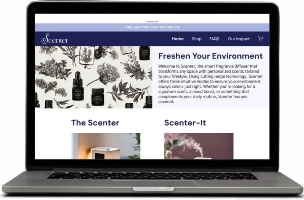
A brand identity and fully responsive website designed for mobile, tablet, and desktop. Each layout was built using consistent grid systems and visual hierarchy to ensure clarity, responsiveness, and ease of use across platforms. The calm, minimalist visuals and clear calls to action reflect the products' tech-forward and wellness-centered identity.
Outcome
While conceptual, the project simulates what a real-world product launch could look like for a fragrance diffuser brand. The visual identity is polished and market-appropriate, while the websites present a user-first experience across screen sizes.
Prototypes
Click to interact in Figma preview.


Reccomendations
To strengthen the Scenter website and bring the experience closer to a real-world launch, future steps could include the following:
User Testing & Feedback: Conduct usability testing to identify pain points in navigation, content clarity, or page hierarchy.
Motion & Interactions: Add subtle animations and hover effects to create a more dynamic and engaging interface while preserving the calming aesthetic.
Reflection
Designing Scenter from the ground up was an insightful experience that let me combine branding and UX/UI design into one cohesive vision. With complete creative ownership, I developed a full product story and strengthened my skills in brand research, user flow design, and cross-platform thinking. It also reminded me of the importance of intentional, beautiful design when creating a product meant for peaceful, personalized moments