Revitalizing A Cafe’s Media Presence
Role
Digital Designer
Scope
Visual Identity • Digital Design • Social Media
Timeline
Spring 2023 • 4 Weeks
Overview
A refreshed brand identity and cohesive digital presence for New Haven’s local coffeehouse, expressed through unified branding, email design, and social media visuals that celebrate community and creativity.
Problem
Koffee? struggled with inconsistent customer engagement and lacked a cohesive brand identity across digital platforms. Their email newsletter was inactive, and their social media presence was minimal, missing key customer retention and loyalty opportunities.
Process
Brand Audit
Koffee?’s primary color is a rich red that matches the bricks of their interior. Their logo combines two typefaces with custom adjustments. The groovy, expressive font used in their slogan reflects the warm and creative personality of the café.
Style Guide
Pairing Raleway and Soda Cream reflected Koffee?’s playful and welcoming personality. Raleway, a clean and bold sans-serif, provided clarity and structure, while Soda Cream added boldness and fun with its thick, expressive forms.
Koffee?’s interior space heavily inspired the final color palette. Brick red serves as the primary color, complemented by two tints that enhance the warm atmosphere, and cream provides balance and softness.


Design Development
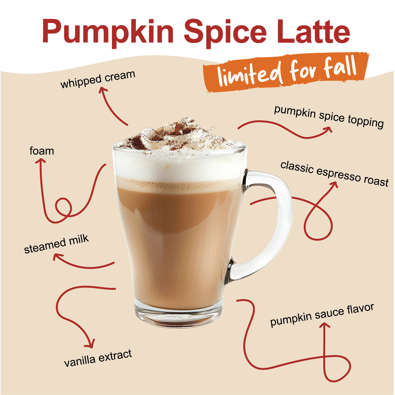
In the early stages, I explored combining photography with illustrated textures. The goal was to create a visual tone that felt artistic, approachable, and aligned with Koffee?’s vibe.
Based on feedback, I adjusted layouts and design elements to better align with the café’s vibe. The final iterations emphasized legibility and brand consistency across email and social platforms.
Solution
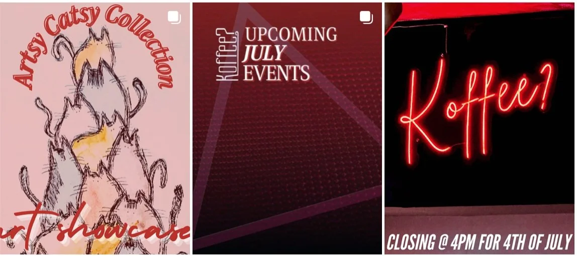
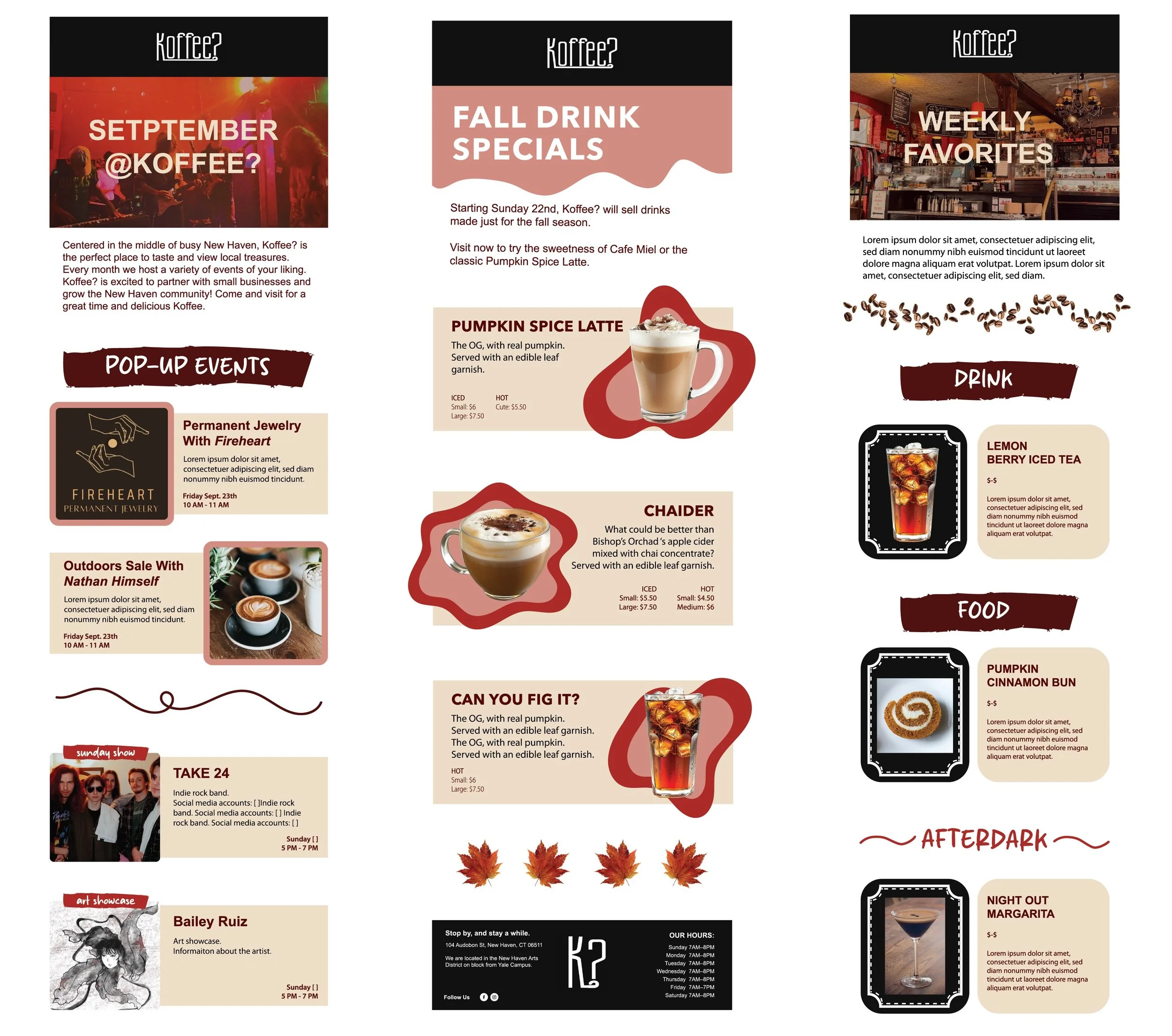
The final deliverables are three email blast designs and native social media posts. The emails include monthly events, weekly favorite features, and a newsletter.
By delivering a cohesive visual identity through emails and social media content, the project reintroduced Koffee? as an engaging and modern brand. Email blasts reactivated dormant subscribers, while social graphics created a visually consistent presence with their values and environment.
Reflection
This was a challenging yet rewarding experience. I had never created email blasts before, so I enjoyed learning how to structure content for a unique type of engagement. Exploring different layout options helped me grow creatively and think more critically about user experience.


