
Logo Stinger

This week, I learned about and animated a logo stinger, focusing on how motion, timing, and sound can reinforce a brand’s identity. A logo animation is often short, but every movement must feel intentional and visually clear. Through this chapter’s reading, I also explored how animation principles can add personality and energy to simple graphic elements. It pushed me to think about how motion design can communicate style and mood in just a few seconds.
Reading
In Chapter 9 of Animated Storytelling, Blazer focuses on the importance of choosing the right animation technique to communicate a story effectively. She explains that animators often prefer the tools and styles they already know, but relying only on familiar techniques can limit how well a story is expressed. Instead, the technique should support the idea, tone, and message of the project. It was detailed that many successful works match their animation style to the story they want to tell. When the technique aligns with the narrative, the animation feels natural and intentional rather than forced.
The chapter also emphasizes thinking about how and where the animation will be viewed. Since content can appear on everything from smartphones to massive digital screens, animators must think about scale, clarity, and visual detail. A technique that works well on a large screen may not translate clearly to a smaller one, and vice versa. Blazer explains that animators should treat technique as a storytelling tool. By choosing a style that reflects the project’s tone and works with its viewing format, creators can better communicate their ideas and improve the overall impact of their work.
5 Principles of Animation
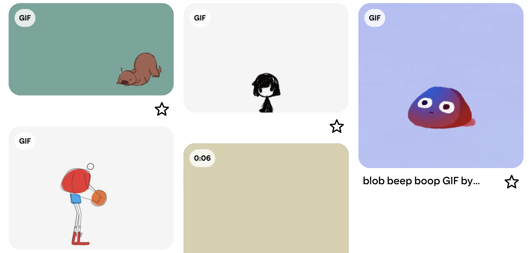
Anticipation: In this animation, an otter prepares to lunge forward before suddenly jumping and faceplanting. The small preparation movement before the action gives the audience a clue about what will happen next. The additional faceplant makes the final movement feel more natural and comedic because the viewer has a moment to expect the action.
Straight Ahead & Pose to Pose: This hand-drawn example is of a little girl “growing up.” The animation has rough edges and sketch-like transitions that reveal how the poses and positions evolve from start to finish.
Squash and Stretch: I chose this expressive blob-like animated face where both the body and face stretch and squash together as it moves. The exaggerated stretching emphasizes the character’s fluidity and personality, while the squashing reinforces the idea of weight and impact.
Appeal: This animation works for the stylized basketball player with exaggerated proportions. Its unique body shapes give the character personality and make the design visually memorable.
Staging: I chose this funny animation because it clearly communicates what is happening with the camera angle and timing. The visual hierarchy and framing ensure the audience understands the action immediately.
Logo Stinger
Full Screen with Audio
For this project, I animated my old logo icon and wordmark. I already had my logo designed in Adobe Illustrator, so I imported the files into After Effects and separated the elements into individual layers. This made it easier to animate each piece independently and adjust its timing within the composition.
The animation begins with three blue stars that rotate slightly, almost like a loading animation. They fade out as the upbeat music starts, which helps create a sense of motion and introduction before the name appears. After that, my name “Allison” fades onto the screen. I used a mask on the letter “o” so that the star inside the letter appears gradually. I then animated the star by scaling it larger and smaller to create a twinkling effect, and I added a small “ding” sound effect to emphasize the motion.
This was my first time animating a logo, and I found it hard to figure out how to animate more than my name. Once I added the star elements, the animation felt more visually interesting and connected to my branding. I also liked how the star sound effect helped reinforce the visual twinkle and gave the animation a playful finish.
Even though the animation is short and simple, the movement and sound should contribute to the overall “feel” of the logo. It was a fun challenge to experiment with animating graphic elements and to see how simple shapes and timing can create a polished logo stinger.

Hi, I’m Allison!
I am a graphic and interactive designer, ready to craft strategy-driven and engaging designs for you now!