
Social Media Promotion for Arts Festival
A series of social media design templates promoting the Student Artists League’s (SAL) first student festival, highlighting collaboration and creativity across the university community.
Role: Graphic Designer
Tools: Adobe Illustrator & Photoshop
Collaborator: Ashley Smith (Graphic Designer)
Timeline: 4 Weeks


The Problem
SAL had no digital promotional materials to announce the upcoming festival, which created a missed opportunity to build anticipation and awareness. Additionally, the festival lacked a cohesive visual identity to unify its messaging and make it recognizable on social media. They decided to partner with Quinnipiac’s American Institute of Graphic Arts (AIGA) club to develop a promotional assets for the festival.
Research
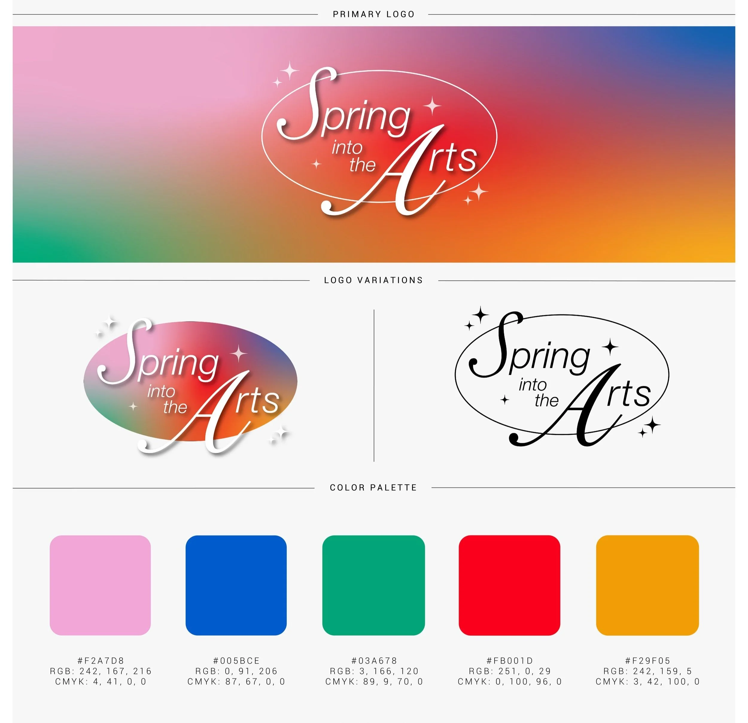
We started by consulting with SAL's founder, Sean Formantes, to understand his vision for the festival. Sean emphasized a desire for bold and bright colors, referencing Jessica Walsh’s art direction for Milly: Color Lover. This direction guided our approach to creating a vibrant, dynamic campaign.
Brand Audit
The existing SAL materials included a simple black-and-white logo, basic typefaces, two design elements, and a five-color palette. The initial branding lacked a cohesive identity for branding assets, leading us to create more color gradients, playful typography, and design icons.
Early Development
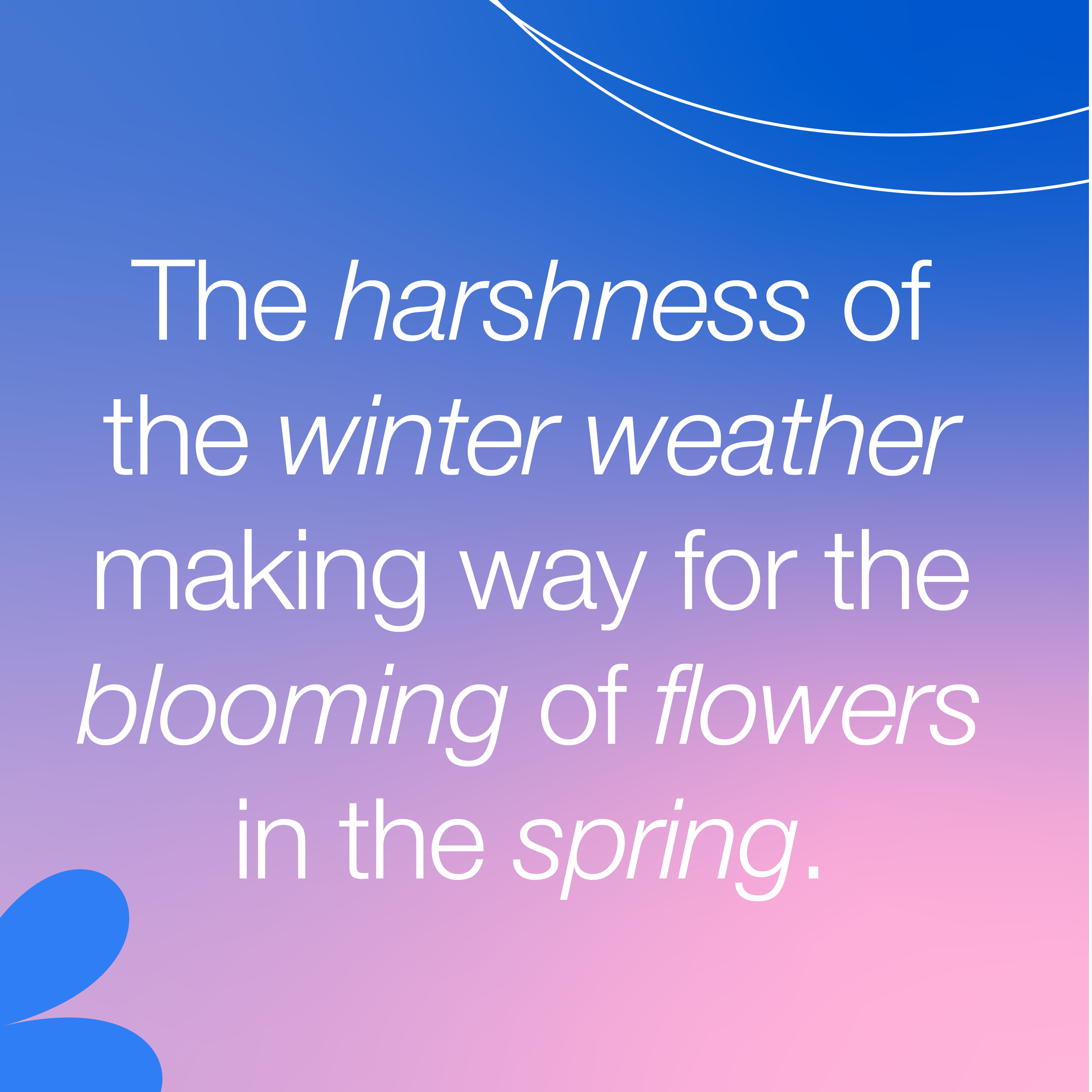
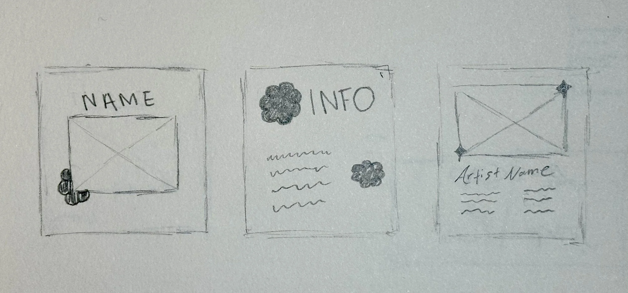
Our initial hand-drawn sketches included layout compositions and visual elements. We featured stars, flowers, and lines to evoke the festival’s lively energy. This was followed by creating digital concepts to explore how these elements worked as social media templates.
Feedback
Based on feedback from SAL and AIGA members, we added more color combinations and increased their vibrancy, made the typeface text bigger to enhance readability, and created additional templates to cover more aspects of the festival promotion.
Drawn + Digital Iterations
The Deliverables
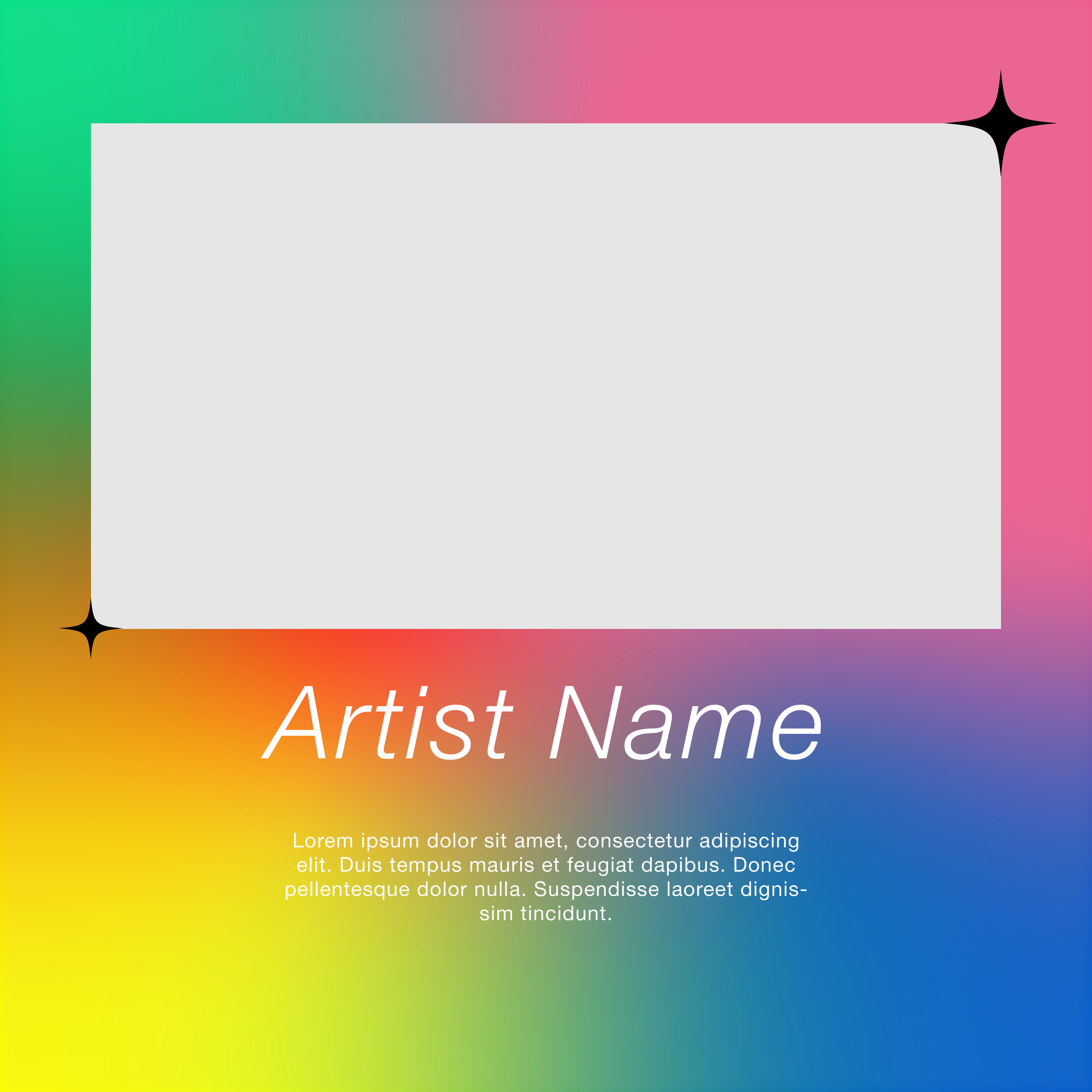
The final design consisted of various vibrant and engaging social media templates, each tailored to promote a different festival aspect.
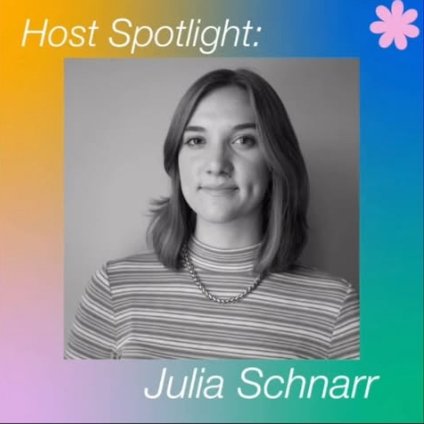
Social media templates include:
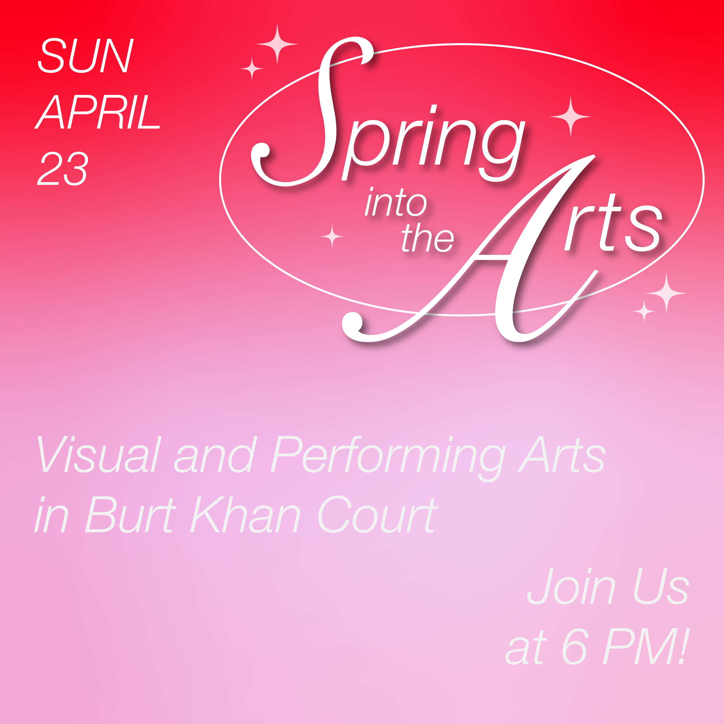
Two Carousels
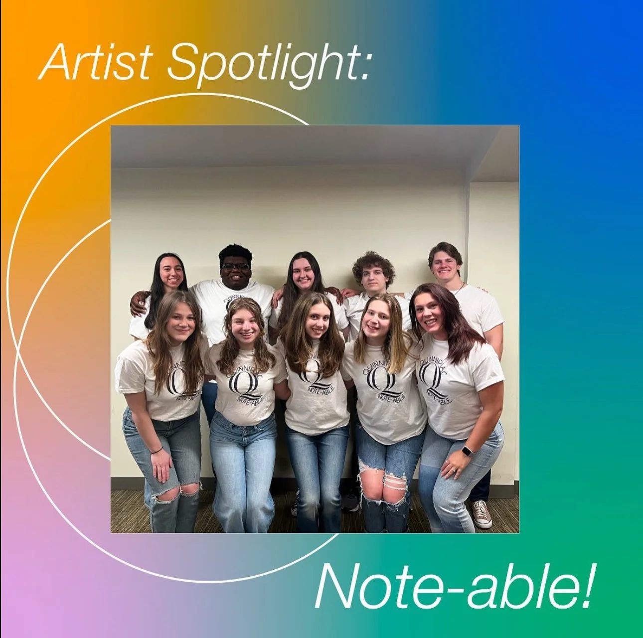
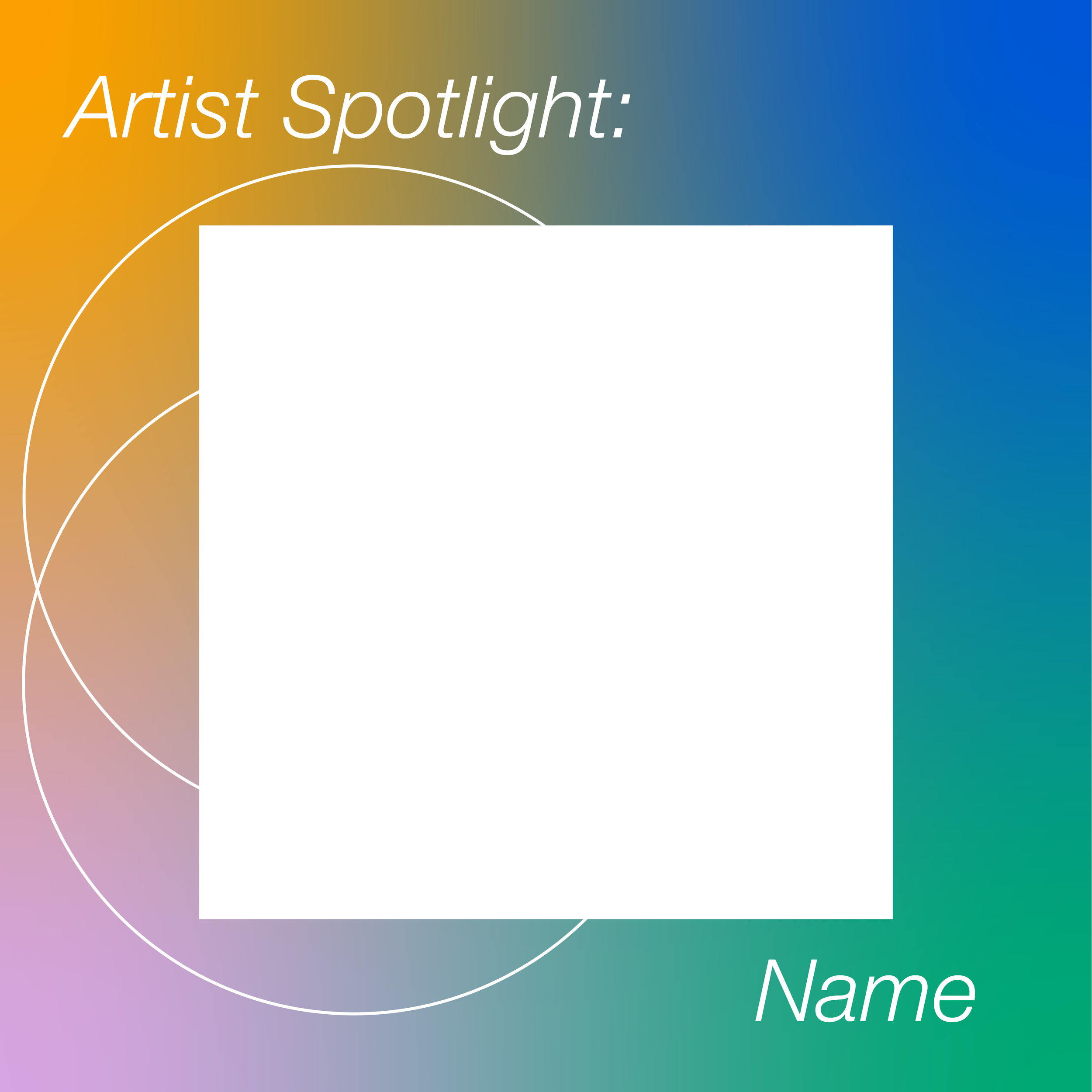
Artist/Host Spotlight
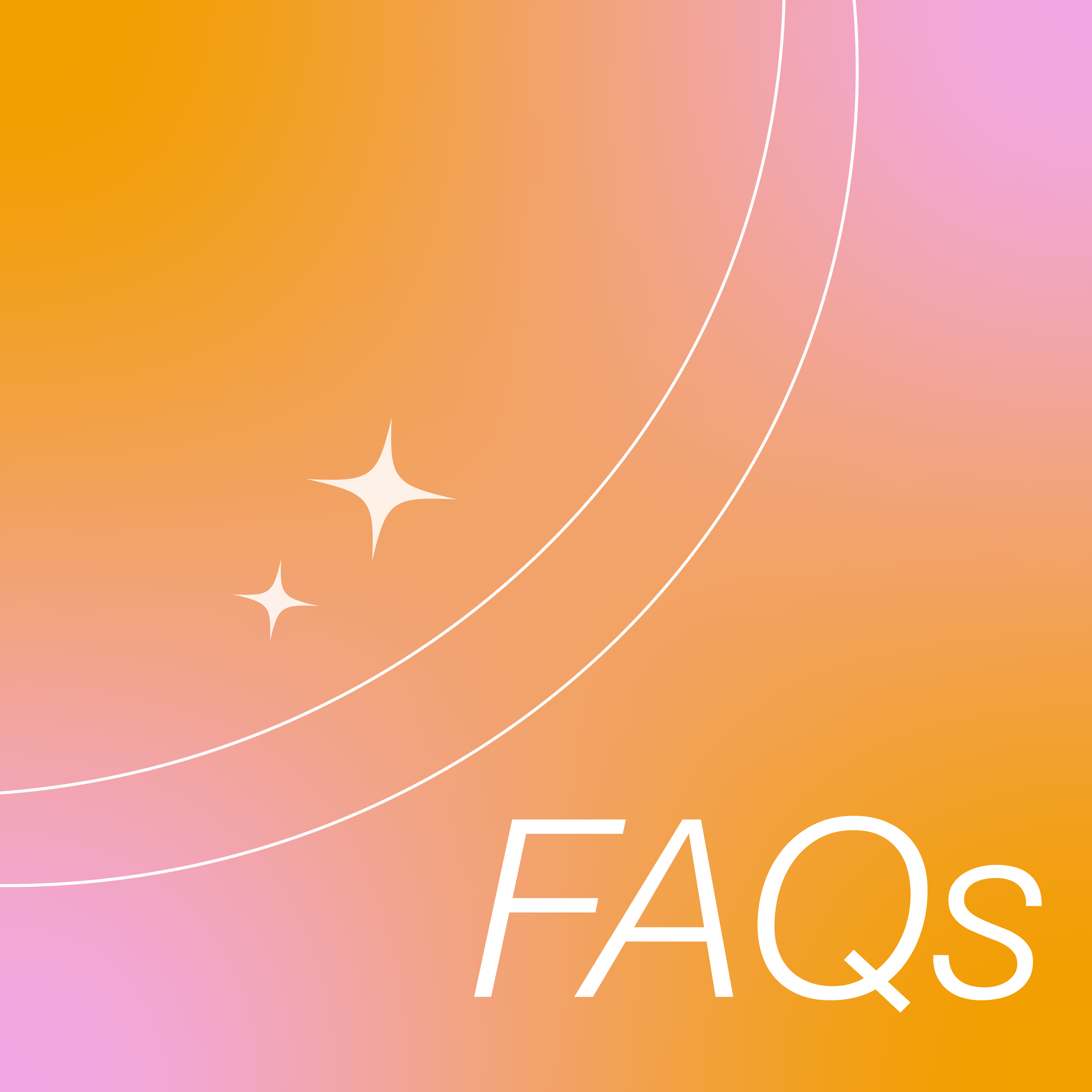
FAQs Carousel
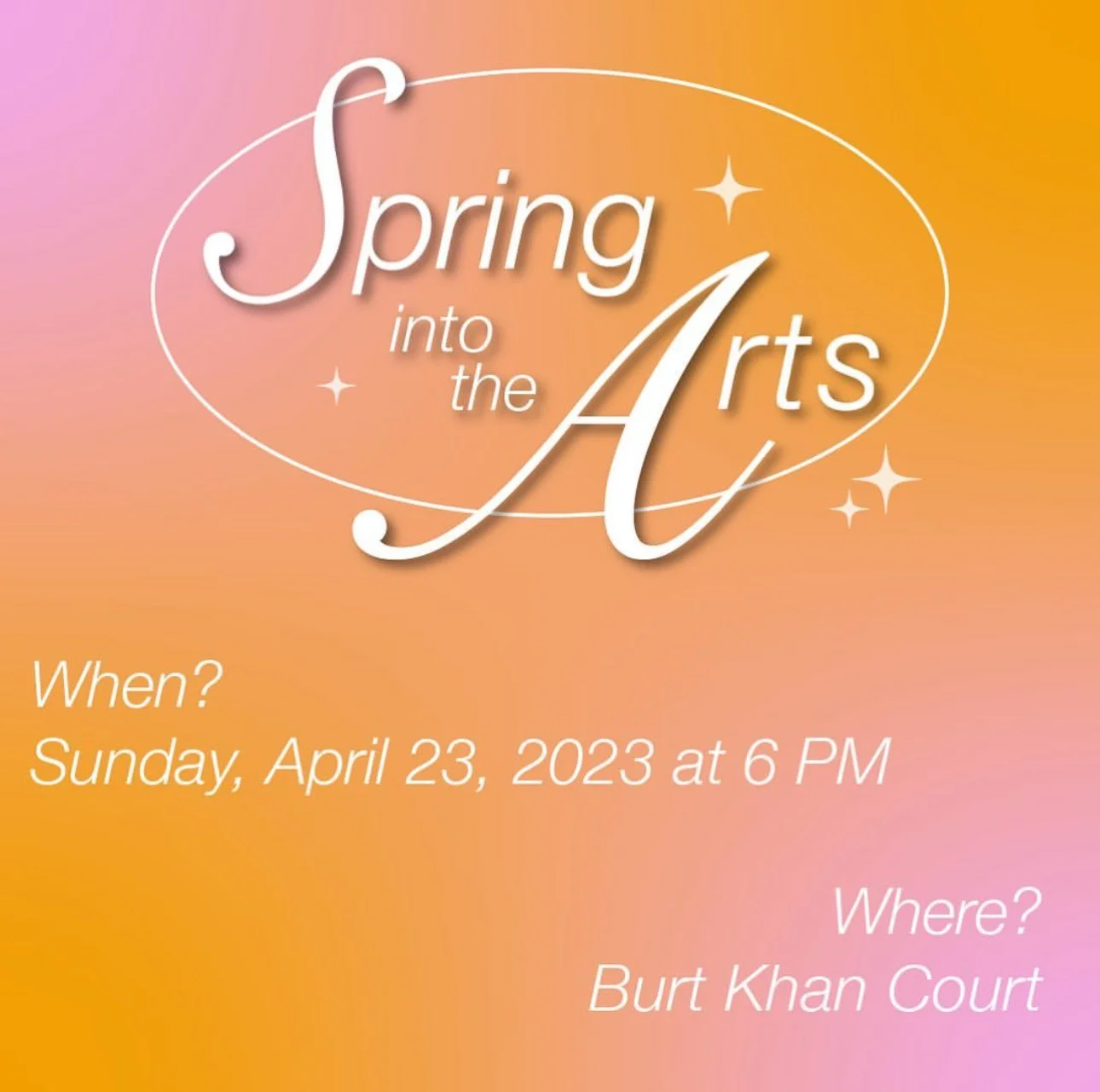
Event Reminders
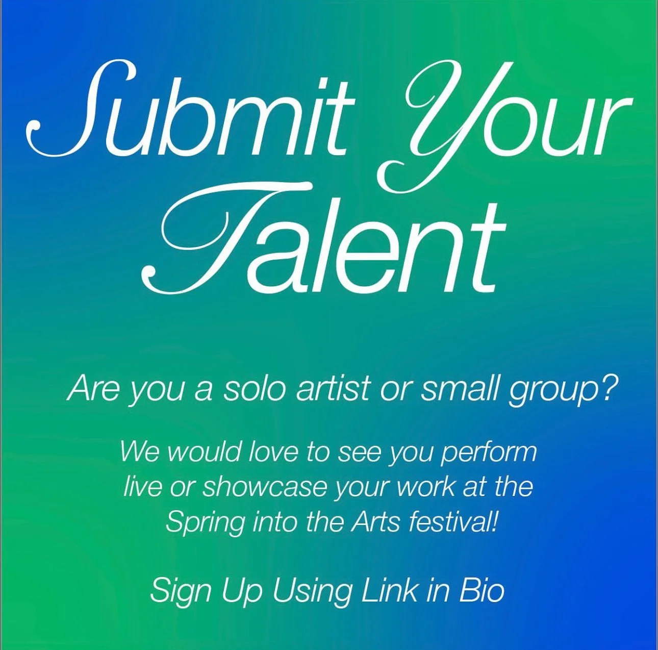
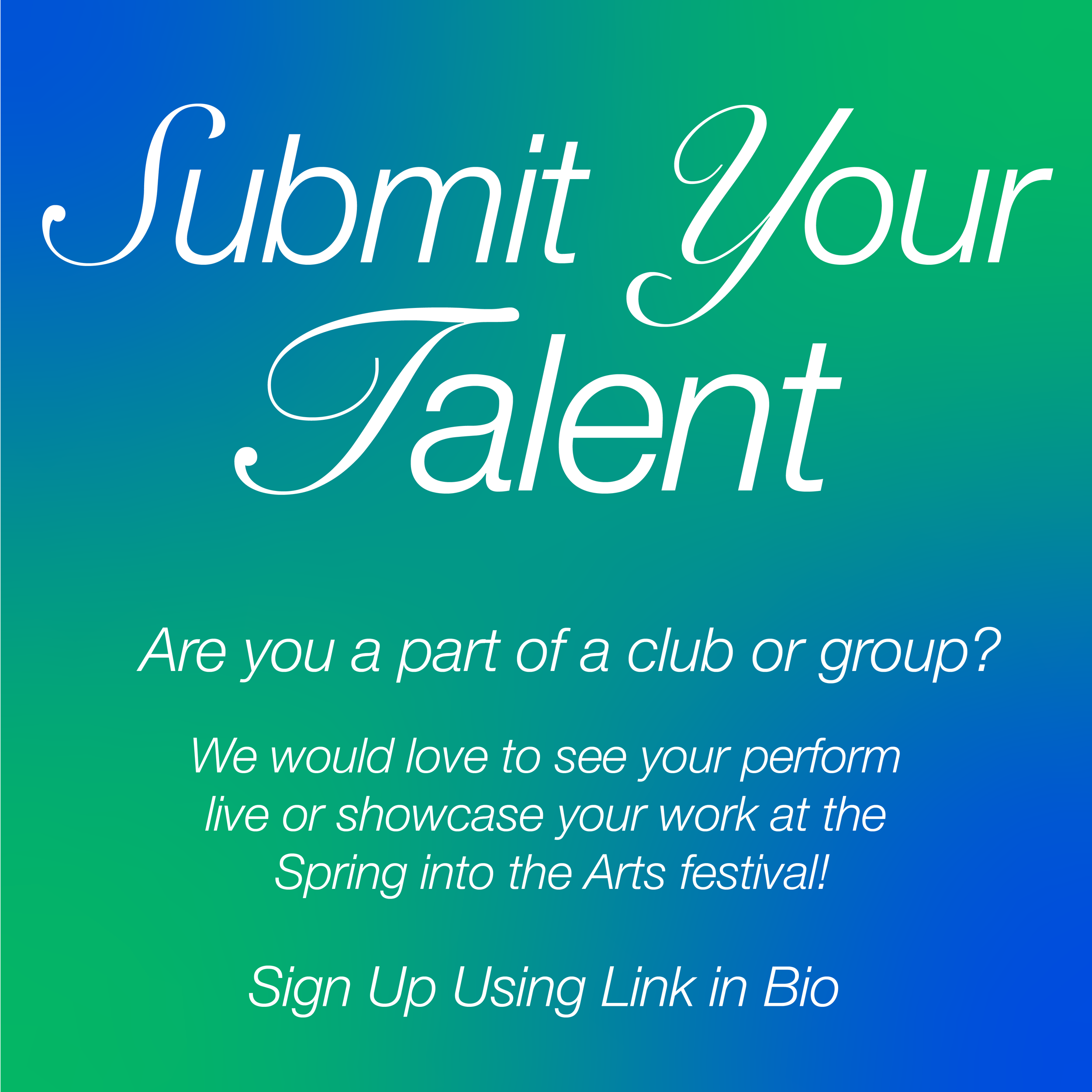
Submit Your Talent
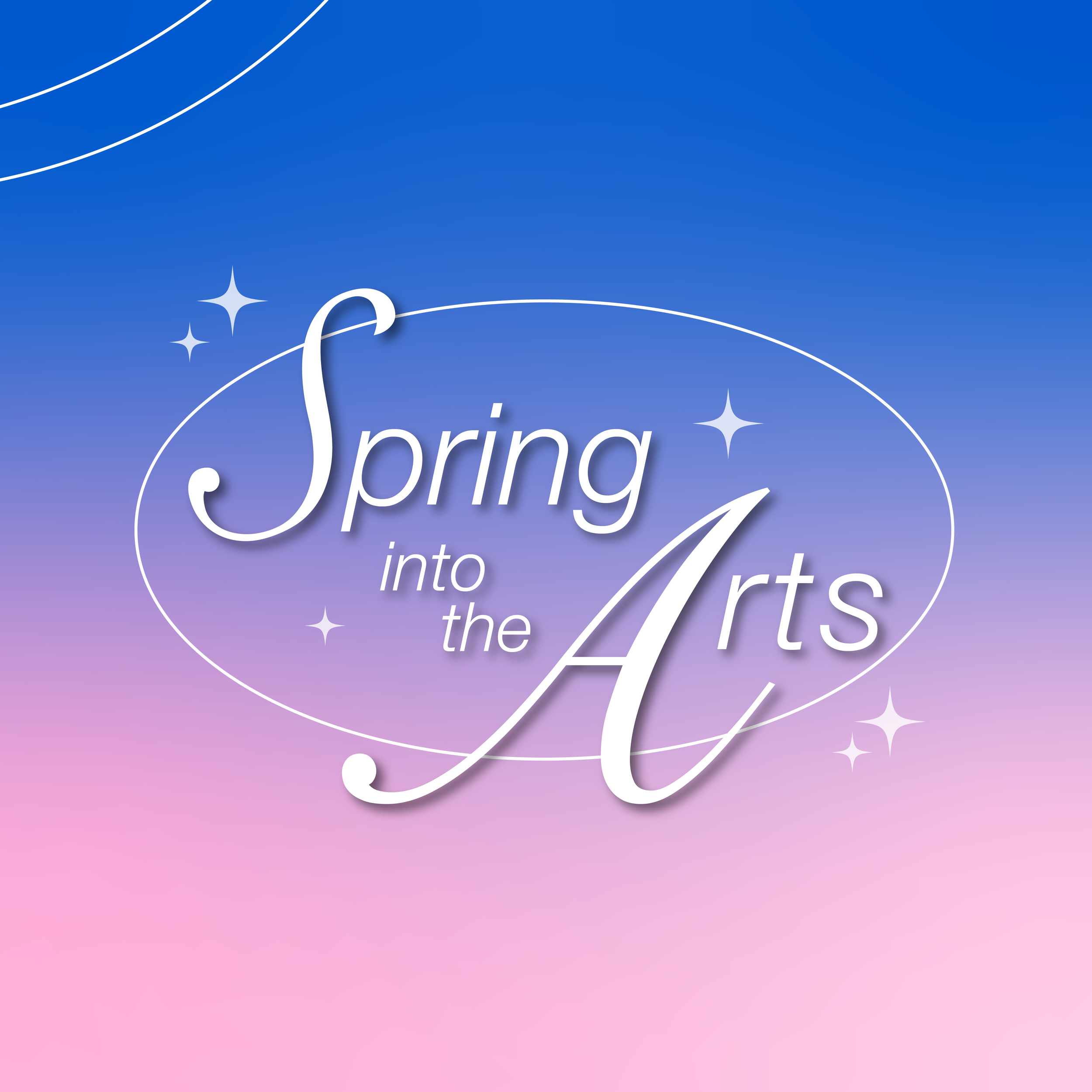
Style Guide
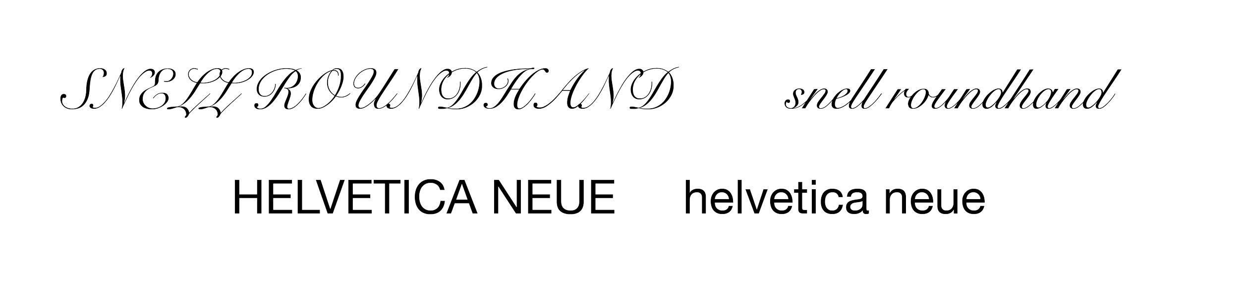
Typography
We used a mix of Helvetica Neue and Snell Roundhand for the headers and Helvetica Neue for the body text. The typefaces were consistent across templates and established a visual hierarchy while maintaining the festival’s fun vibe.
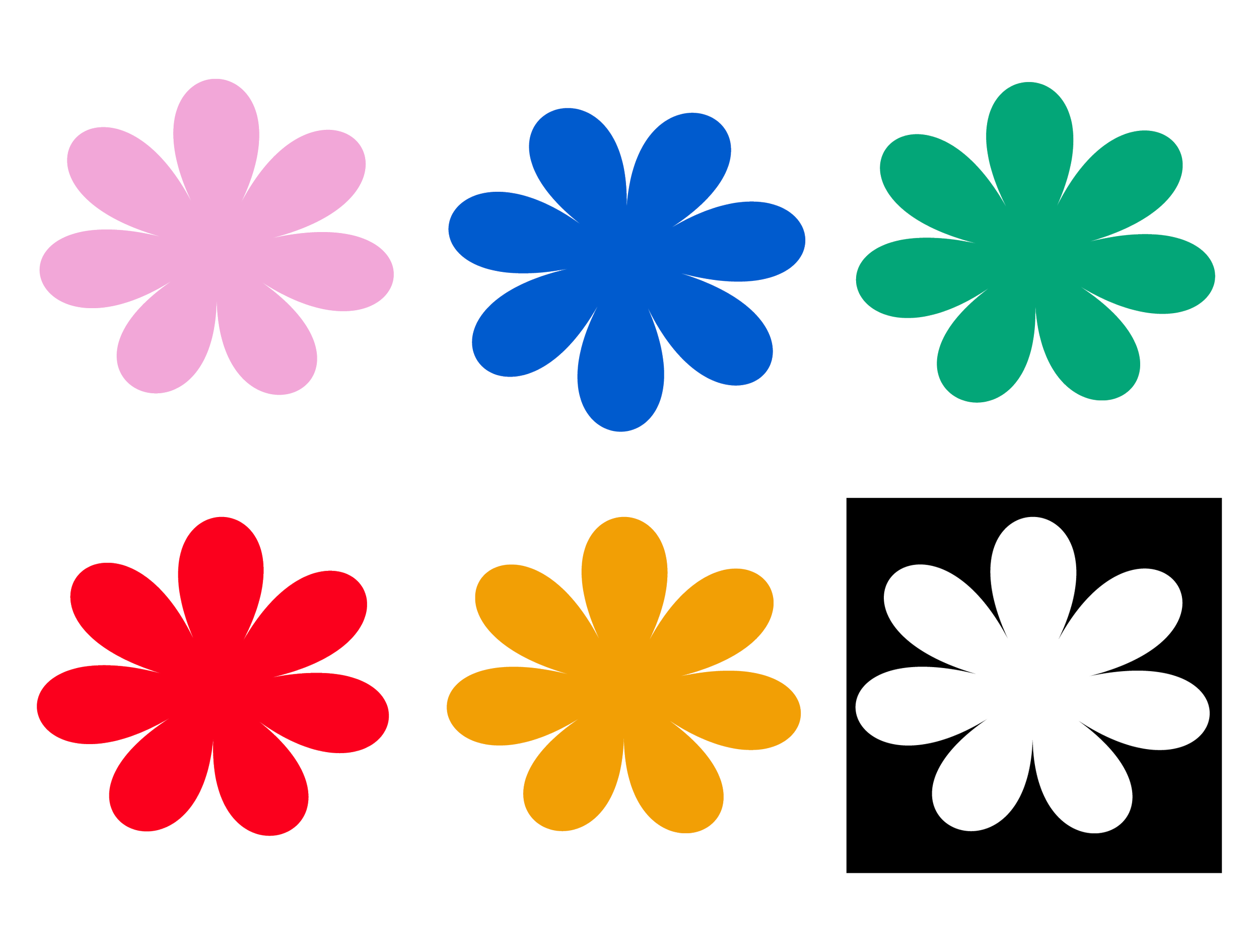
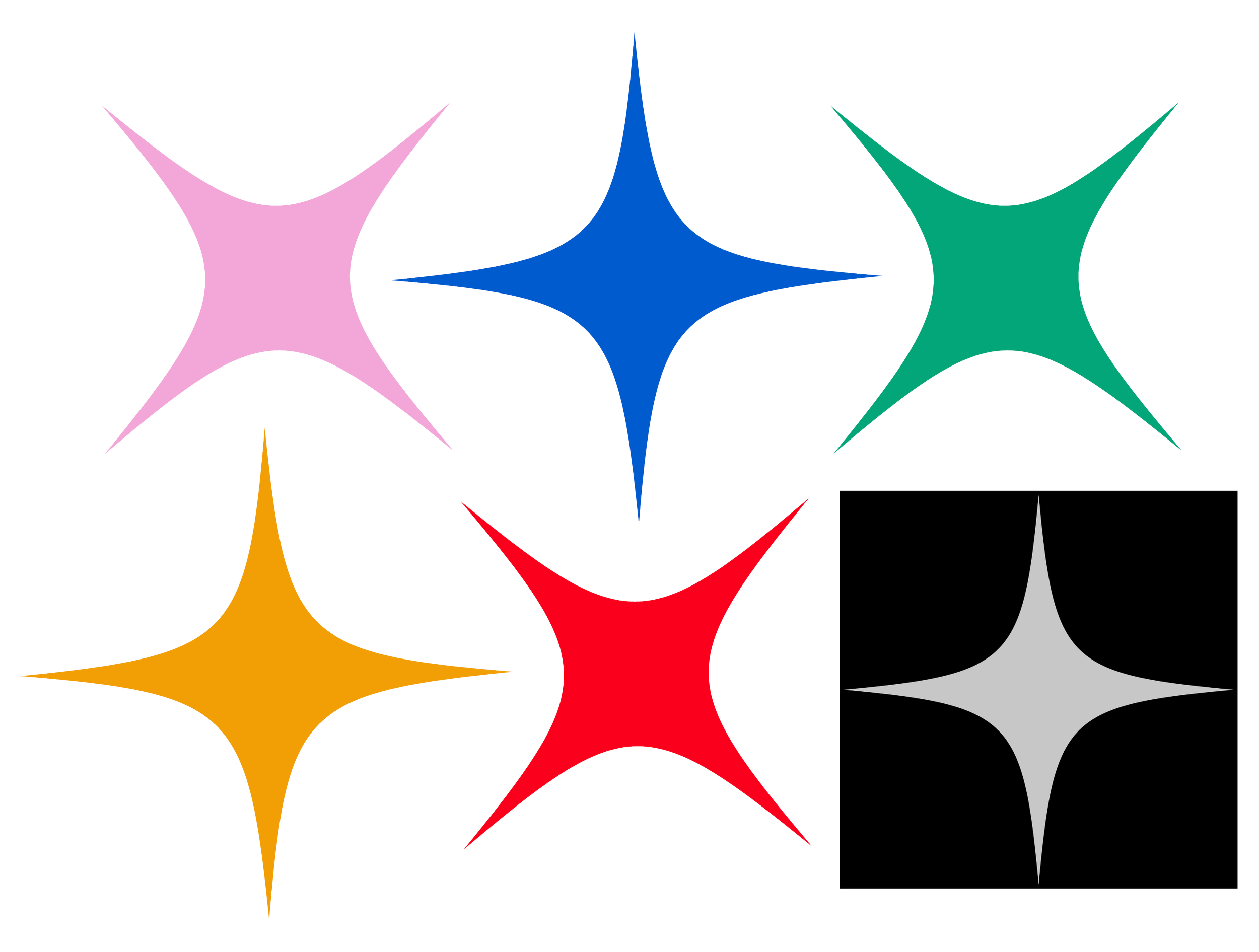
Gradient Variation
In addition to the original palette of five vibrant colors, we created several gradient variations that reflect the festival’s creative energy. The color gradients added dimension and flexibility to the final design, reinforcing the artistic theme.
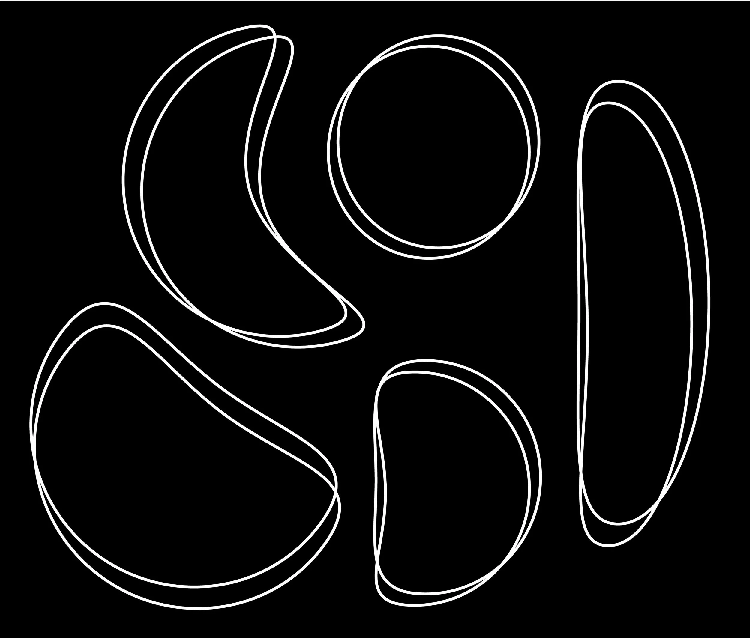
Graphic Elements
The final design elements of stars, flowers, and fluid lines showed artistic expression and created a sense of movement. The graphic elements create visual interest and align with the festival’s bold theme.

Solution
The templates solved the initial problem of having no digital materials by providing SAL with versatile, eye-catching designs that were easy to update and publish on social media channels. The template variations’ vibrant color schemes and playful elements reflected the festival’s energetic feel while maintaining brand consistency.
Outcome
The templates:
Enabled SAL to post 23 times in one month
Enhanced social media presence
Boosted social media engagement
Encouraged festival attendance
Drove artist submissions
Promoted the festival and participating artists
Expanded organization visibility in the Quinnipiac community
Key Learnings
This project was a valuable learning experience, particularly in the areas of design collaboration and design versatility. Working with another designer and members of SAL and AIGA required clear communication, which provided insights into client relations and task delegations. I also learned the importance of versatile design assets, especially in social media. The templates are flexible and updatable, quickly adapting to new needs.
Reflection
Partaking in this campaign was a fascinating opportunity to collaborate with another designer and directly engage with student organizations on shared goals. It taught me the importance of visual consistency in social media campaigns and the power of creative design in generating interest and participation.
Overall, this project gave me a unique, collaborative experience designing for social media. It further taught me the importance of social media presence in creating visibility and enhancing engagement.