
Reviving A Vintage Store's Visual Brand
A refined brand identity and marketing asset system capturing the boutique’s timeless aesthetic through elegant visuals and cohesive storytelling.
Role: Brand + Graphic Designer
Tools: Adobe Illustrator & Photoshop
Scope: Branding, Print Design
Timeline: 8 Weeks
The Problem
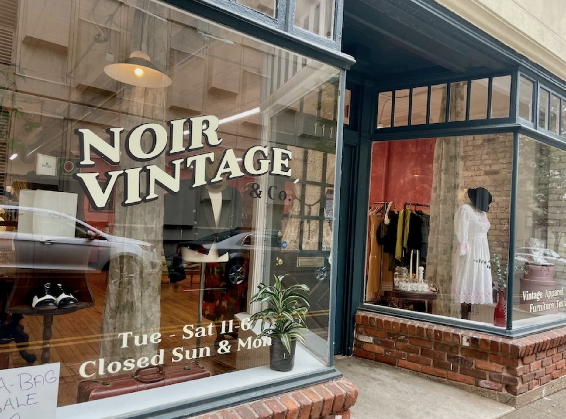
Noir Vintage & Co. needed a cohesive brand identity to stand as a new store in New Haven. The lack of visual unity negatively impacted brand awareness and customer engagement, especially on social media, where potential customers struggle to recognize the brand.
Research
The project began with in-depth discussions with the store owner to understand their vision for a new brand identity. The client expressed a desire for a visual identity that reflected their vintage aesthetic while incorporating nature-inspired elements.
Key Decision Points
The client required the store name and plant motifs to be integrated into the logo. The combination should reflect the elegance and nostalgia of vintage fashion and their enthusiasm for growth and sustainability.
Brand Audit
Reviewing existing visual materials revealed inconsistent typography, color usage, and imagery. The previous logo attempted to incorporate too many elements, resulting in a cluttered, disorganized appearance.


Initial Sketches
I developed numerous hand-drawn sketches, exploring relationships between typography and illustrated icons. I focused on creating aesthetically appealing and balanced visuals.
Incorporated elements include:
Hats
Flowers
Shoes
Jewelry
Instrument
Vintage Patterns
Digital Iterations
The first digital concept leaned heavily into floral elements, with the store’s name curved above an arrangement of plants. Color exploration included vibrant colors for a modern touch and a grayscale version for contrast.
The second digital concept was a simplified design featuring two minimalistic flowers framing the store name, with the typography slightly curved. Variations focused on adjusting the plant curvature to achieve visual harmony with the type and illustrations.
Feedback
Client feedback indicated a preference for more subtle, stylized plant elements. They also preferred a subdued color palette that aligned with the store’s vintage appeal without being overly bright or vibrant. Additionally, they wanted a clear typeface with no outline, which promoted further typography exploration that conveyed modern, vintage elegance.
The Deliverables
The new visual identity for Noir Vintage & Co. successfully balances vintage aesthetics with illustrated designs through several carefully considered elements.
Logo
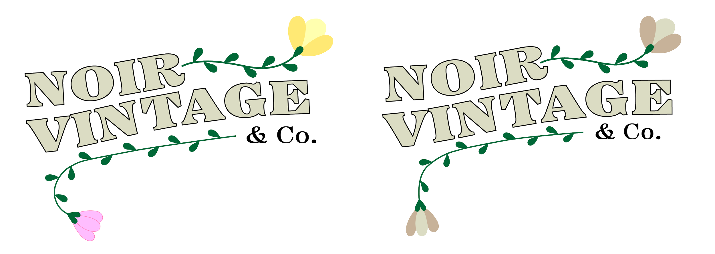
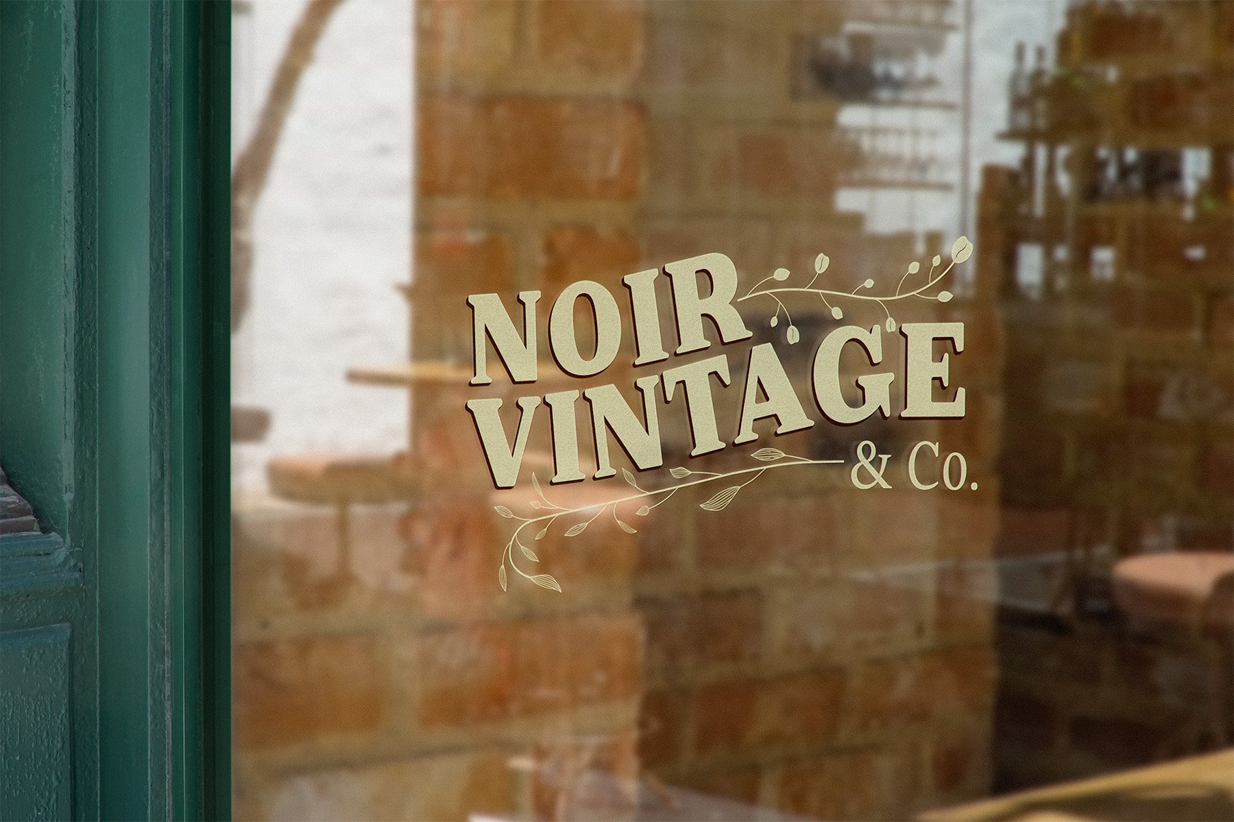
The final logo design features “Noir Vintage & Co.” in a wave-like curve to create visual movement. Two plant illustrations are strategically placed (one at the bottom left and another at the top right) to follow the wordmark curve, creating a harmonious composition.

Style Guide
Typography
Battlefin was chosen as the typeface for its bold yet refined look, aligning with the store’s sophisticated vintage aesthetic. “NOIR VINTAGE” appears in the Black weight for emphasis, while “Co.” is set in Regular to create hierarchical balance.
Gradient Variation
A palette of four muted tones was developed to reinforce the vintage, nostalgic feel of the brand. These colors allow for flexible application across digital and physical platforms, enhancing the brand’s image via versatility and consistency.
Graphic Elements
The final design features two distinct plant illustrations that align with the client’s request for nature-inspired imagery. Their placement follows the curve of the wordmark, enhancing visual harmony and reinforcing the brand’s timeless yet natural feel.


Solution
This identity system solved the initial problem of a lack of brand cohesion by creating a visually unified identity that:
Balances simplicity with distinctive elements, ensuring memorability
Allows versatile applications across all customer touchpoints
Clearly and visually communicates vintage and botanical themes without visual clutter
Outcome
Once the new brand identity is implemented, we anticipate the following:
Enhanced customer experience, fostering a vintage-loving community
Increase social media engagement
Improved website traffic, boosting online sales
Higher in-store traffic, particularly among first-time customers
Better brand recognition in the local New Haven market

Key Learnings
This project reinforced several important principles for me, particularly in the design process. Finding the right balance between vintage elements and modern design was crucial. Ultimately, simplifying the process made a stronger, more versatile identity.
If I were to approach this project again, I would incorporate more design feedback during the development phase. Gathering outside perspectives from target customers could have revealed additional input to strengthen the final solution.
Reflection
This project was a rewarding experience as I was the sole designer, managing the entire process from discovery to delivery. The opportunity to work directly with the client provided valuable insights into client communication and project management.
Overall, this project improved my understanding of how thoughtful visual identity design can transform a brand’s market position and customer perception. The approach used to solve this design challenge has become a valuable framework that I continue to apply to new projects.