Futura Specimen Booklet
Role
Booklet Designer
Scope
Typography • Print Design • Layout • Design
Timeline
Spring 2025 • 4 Weeks
Overview
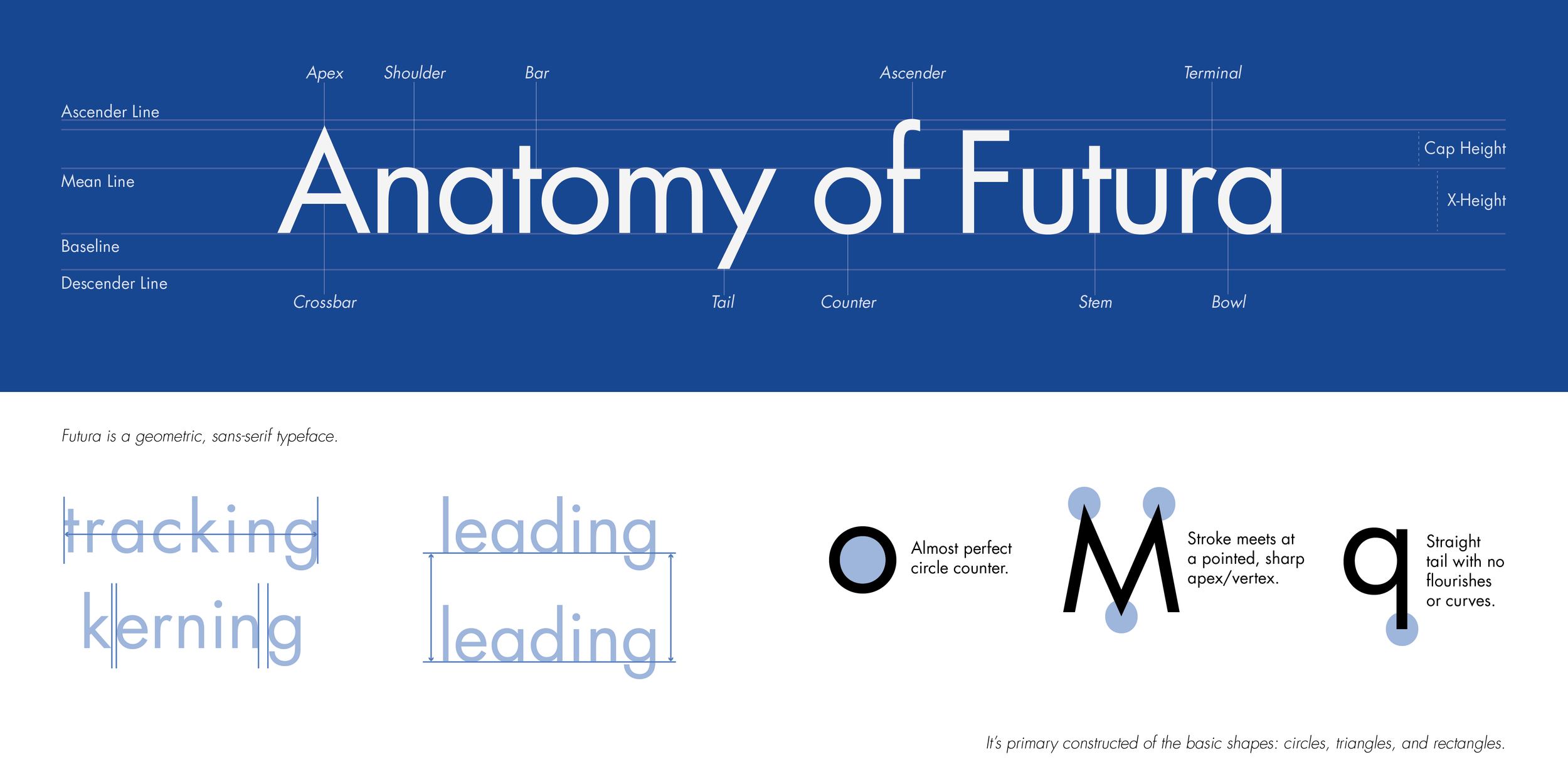
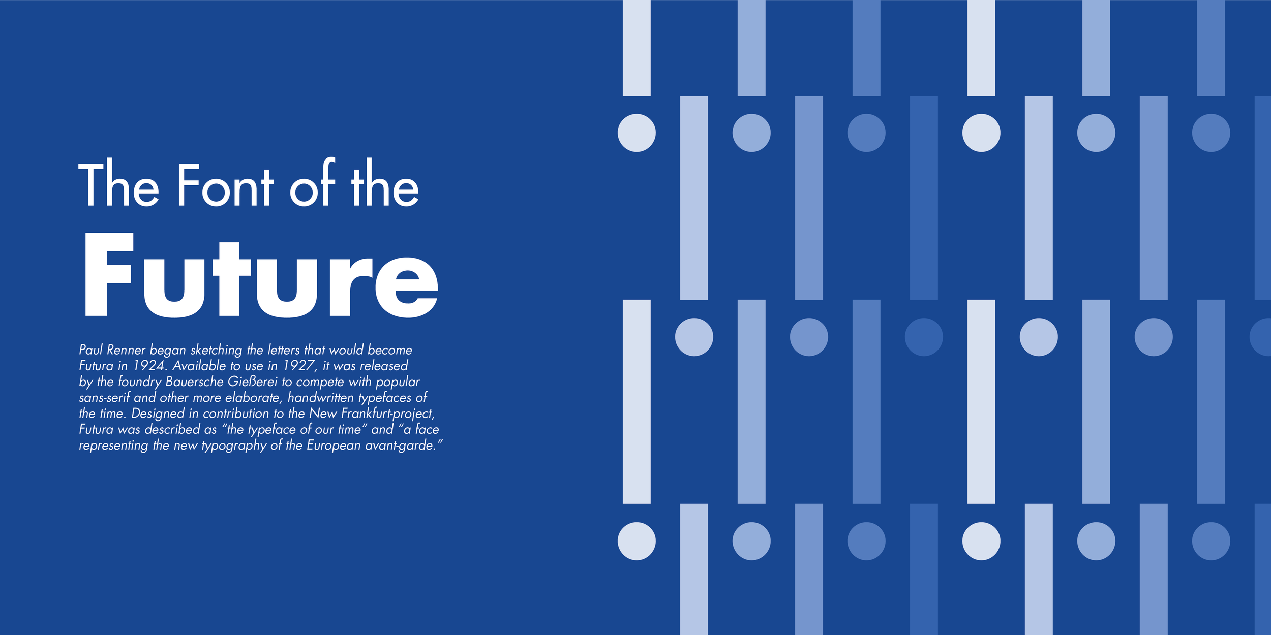
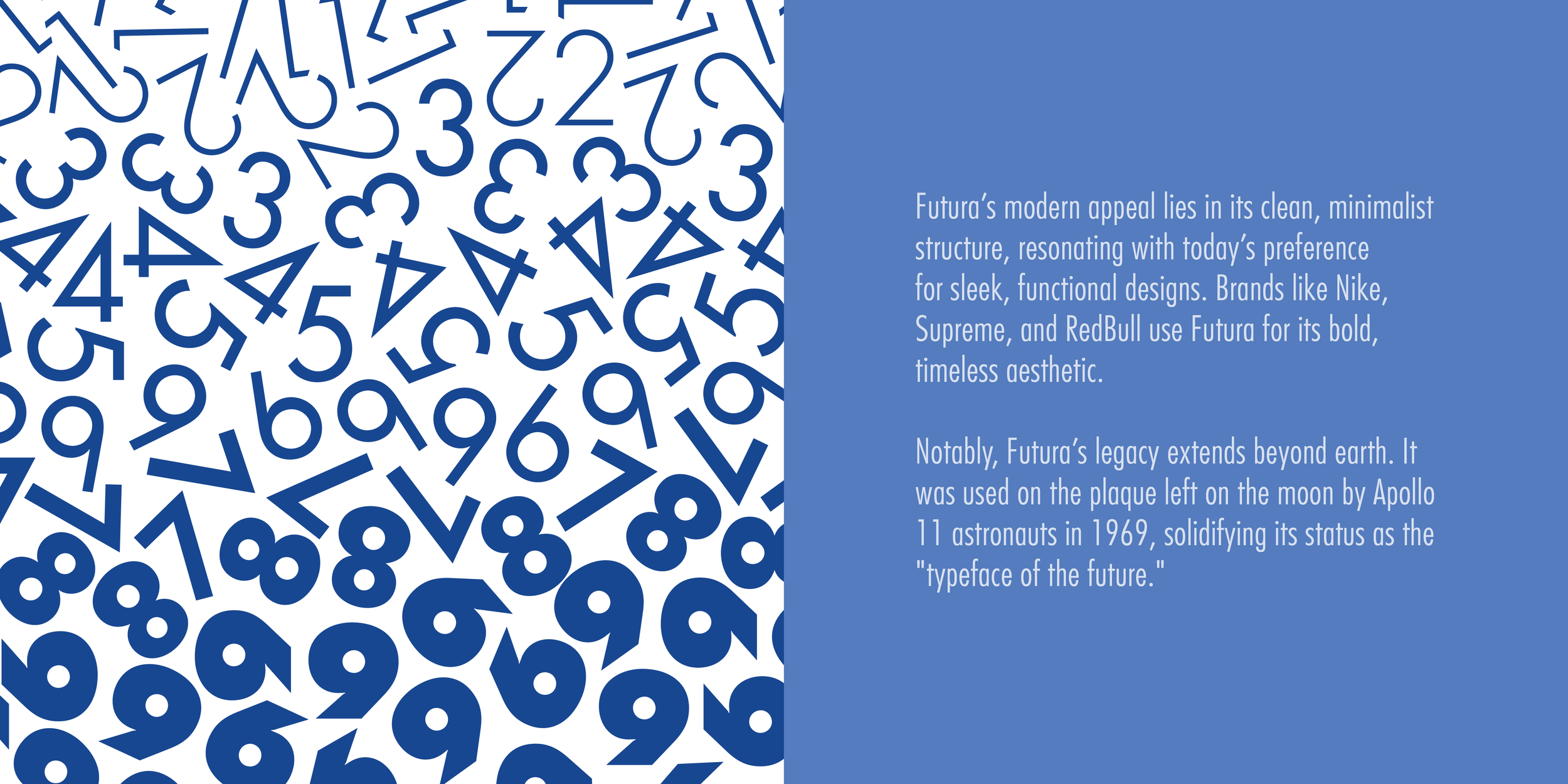
Futura, designed in the 1920s, is known for its geometric precision and modern simplicity. I was drawn to its clean, structured appearance and wanted to highlight that quality through a carefully designed specimen.
This project focused on creating a minimal, typography-driven booklet that showcases both the typeface’s visual appeal and technical details.
Objectives
Design a specimen booklet that is both engaging and highly legible, addressing a common issue where type specimens prioritize style over readability. The booklet needed to:
Highlight Futura’s versatility through typography-driven layouts
Maintain a cohesive visual system
Balance visual storytelling with clarity
Present research-informed content that educates the reader
Process
Research
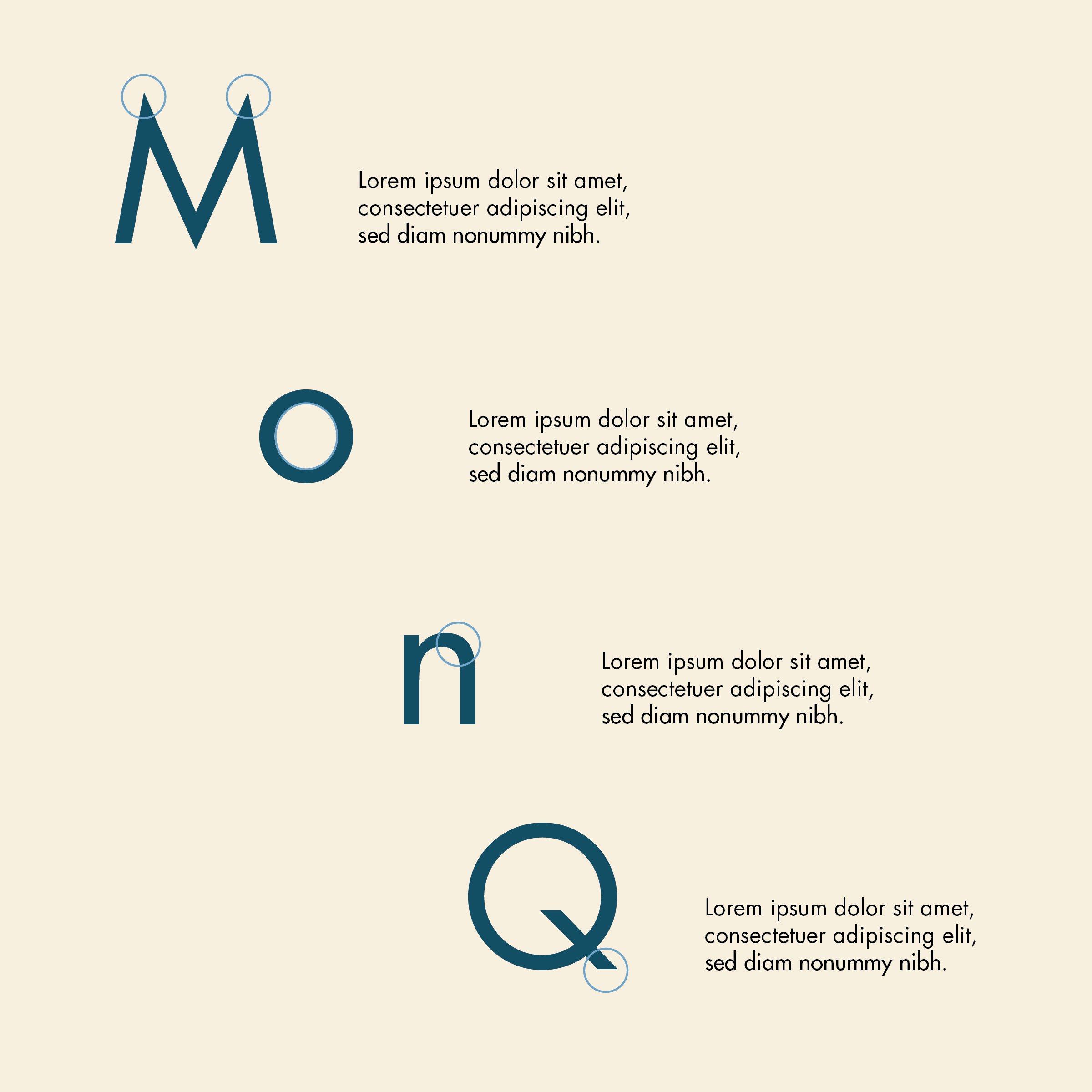
I began by gathering inspiration from editorial and typographic design on Pinterest. I analyzed layout structure, font weights, repetition, color usage, and white space. The goal was to create a simple visual system that reflects the foundations of Futura, including its geometric forms, consistent stroke weight, and alignment.
Design Development
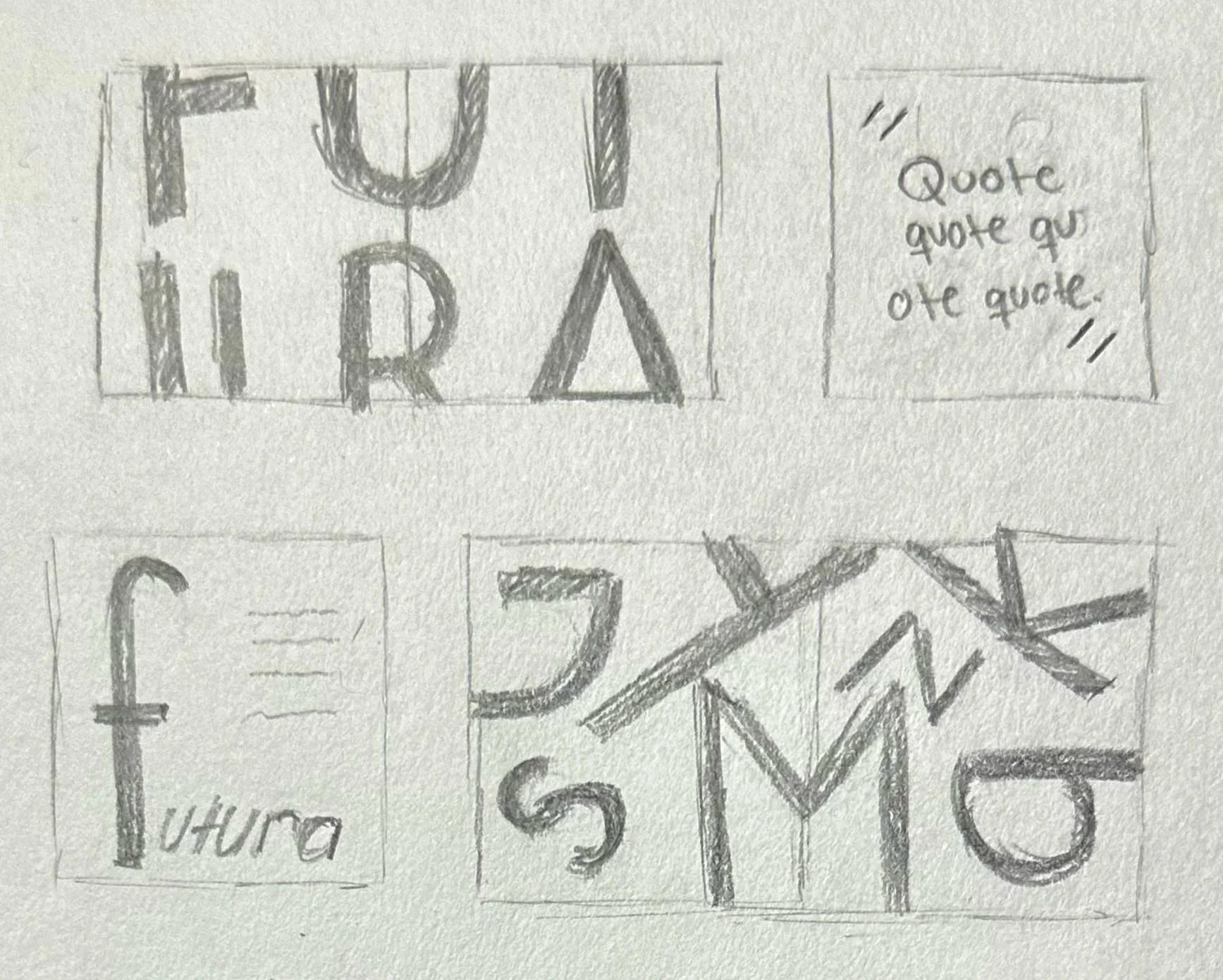
Sketched a range of page layouts, from single pages to full spreads, then translated those ideas into digital compositions. I developed three initial compositions, each with a distinct color palette and layout ideas. From there, I refined the design by experimenting with scale, hierarchy, opacity, and typographic details.


Solution
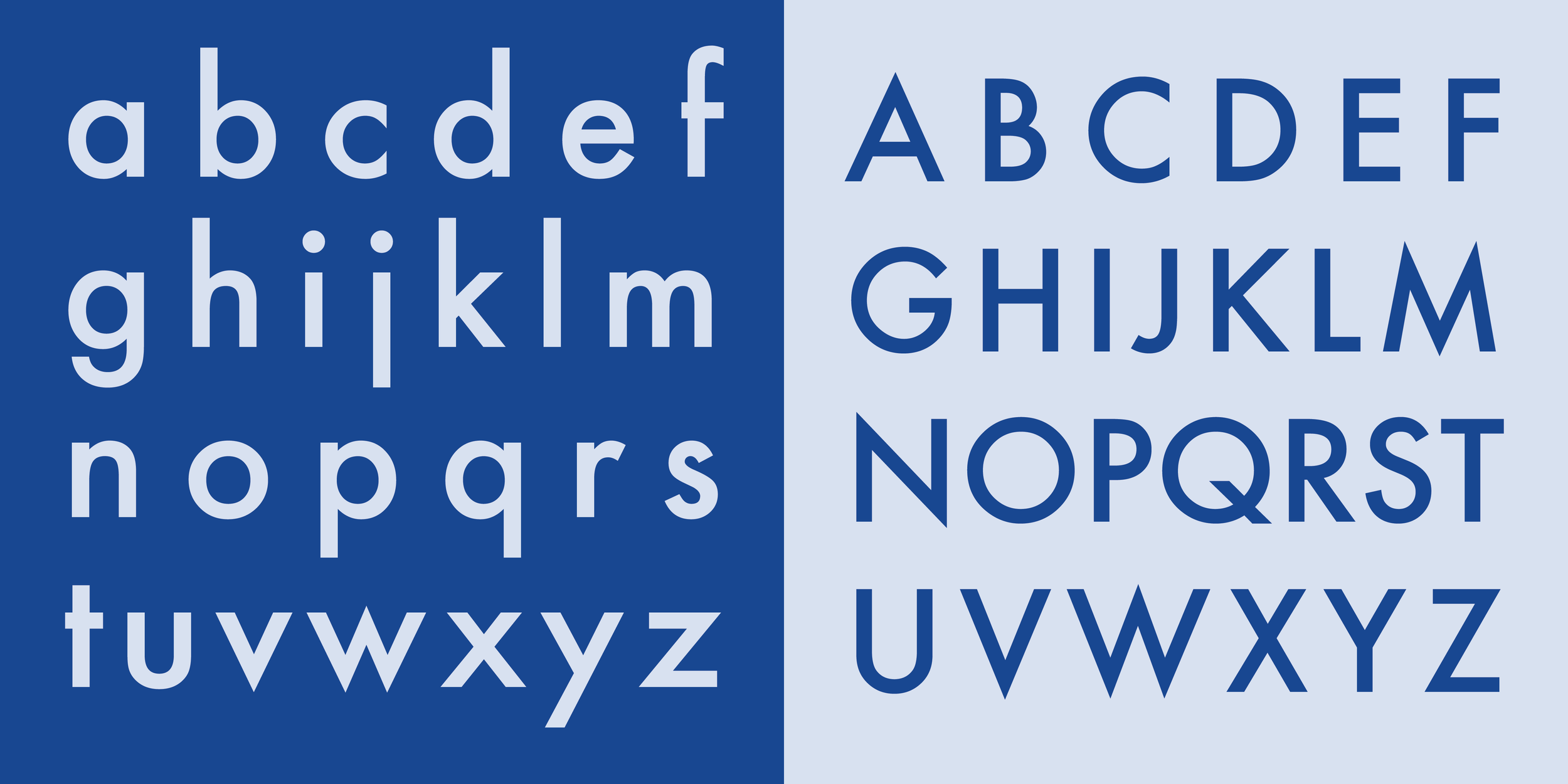
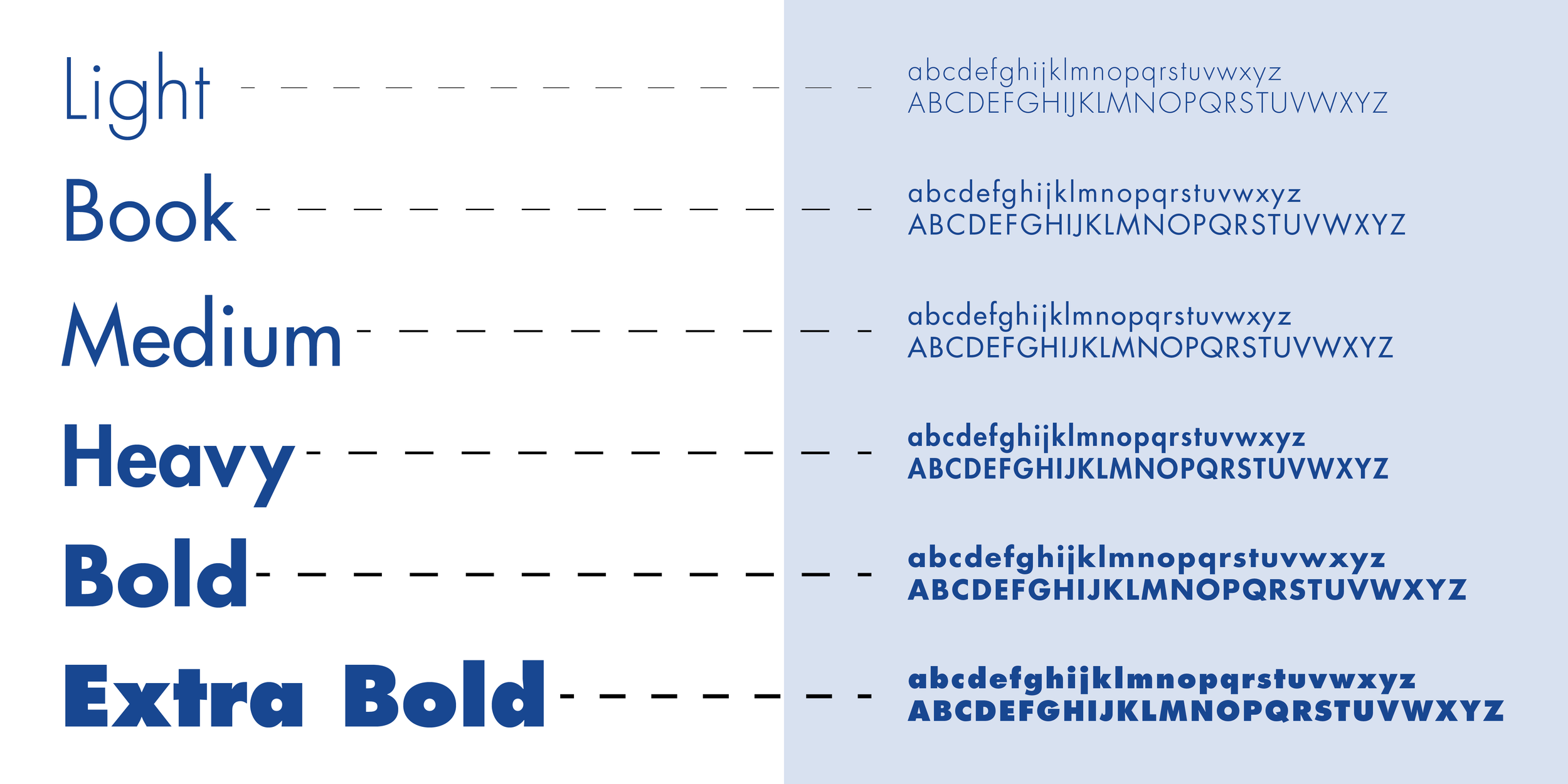
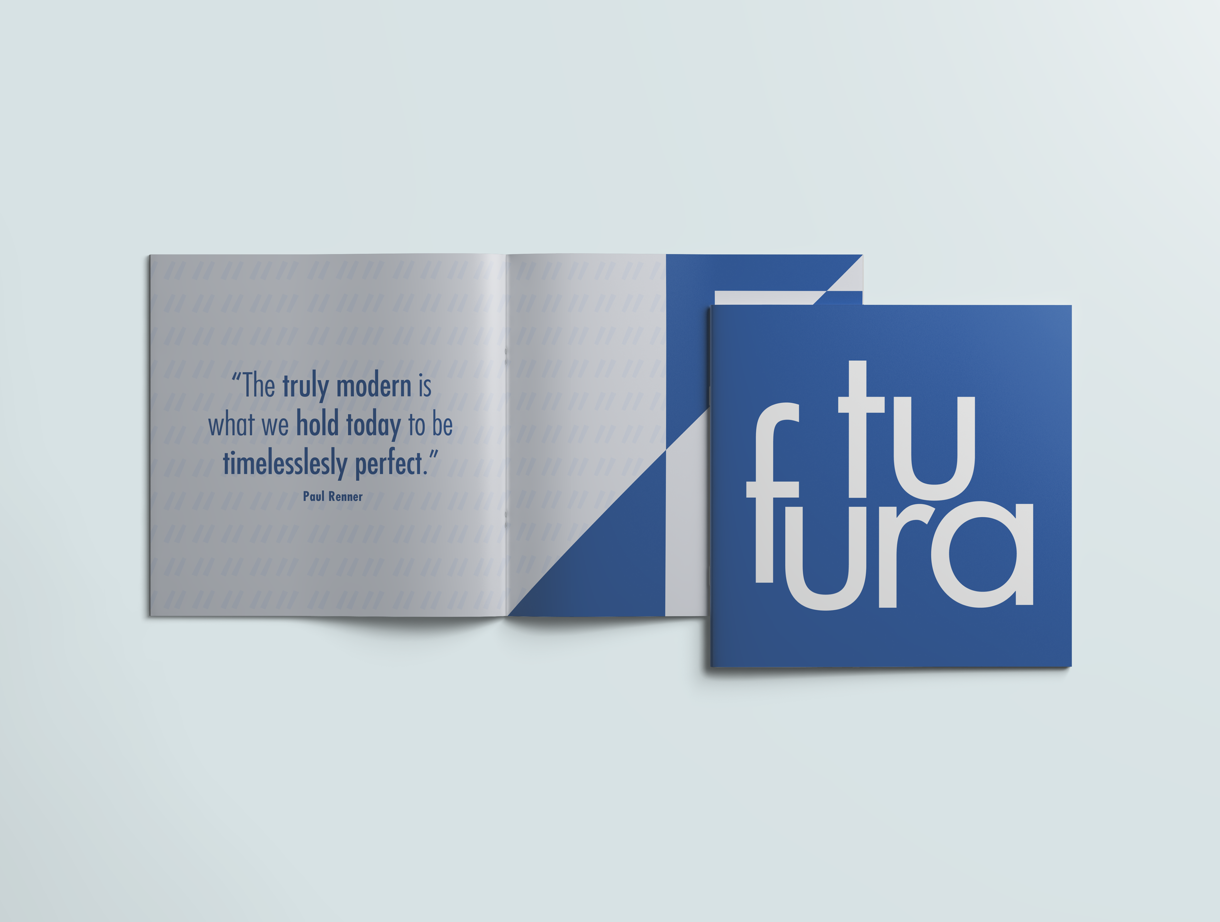
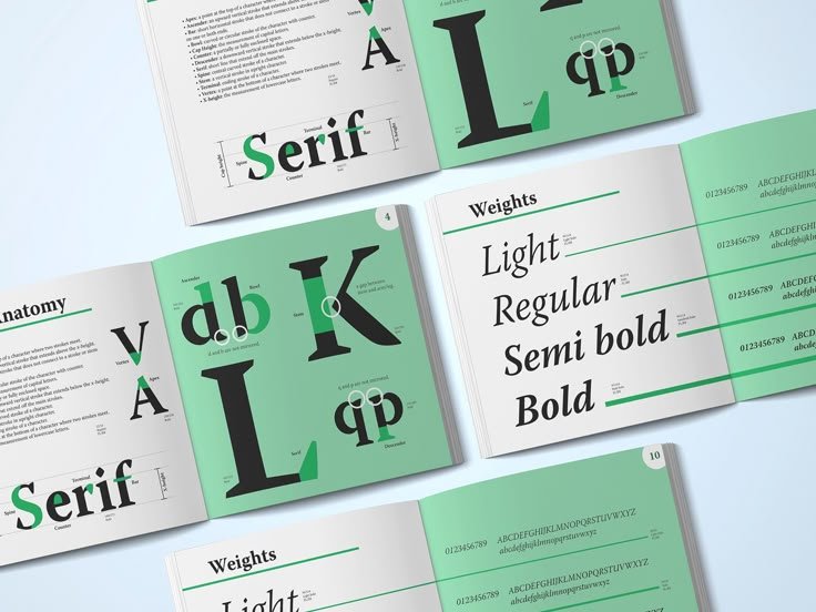
The outcome is a 14-page specimen booklet, including front and back covers, that presents Futura clearly and engagingly. The design uses a restrained blue color palette and structured layouts to guide the reader through the content. By relying exclusively on Futura, the booklet demonstrates the typeface’s range, personality, and functionality while maintaining a consistent visual voice throughout.
This project reinforced the importance of strong typographic fundamentals. Working within the constraints of a single typeface pushed me to be more intentional with layout, hierarchy, and spacing. It also deepened my knowledge of how typography alone can create visual interest, communicate information, and shape the overall reading experience.
Reflection