Packaging Design for NY Coffee Shop
Role
Package Designer
Scope
Print Design • Packaging
Timeline
Spring 2025 • 4 Weeks

Problem
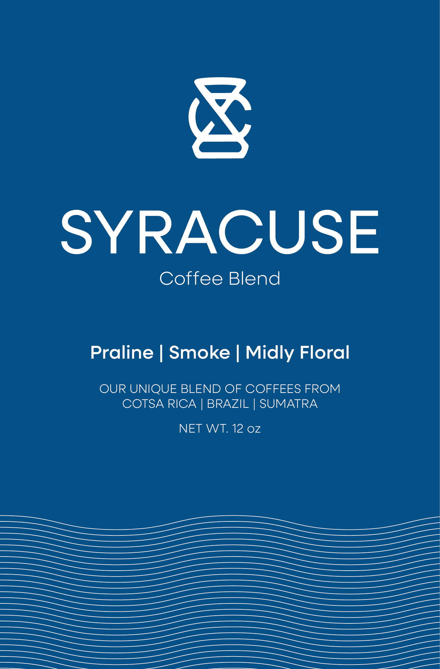
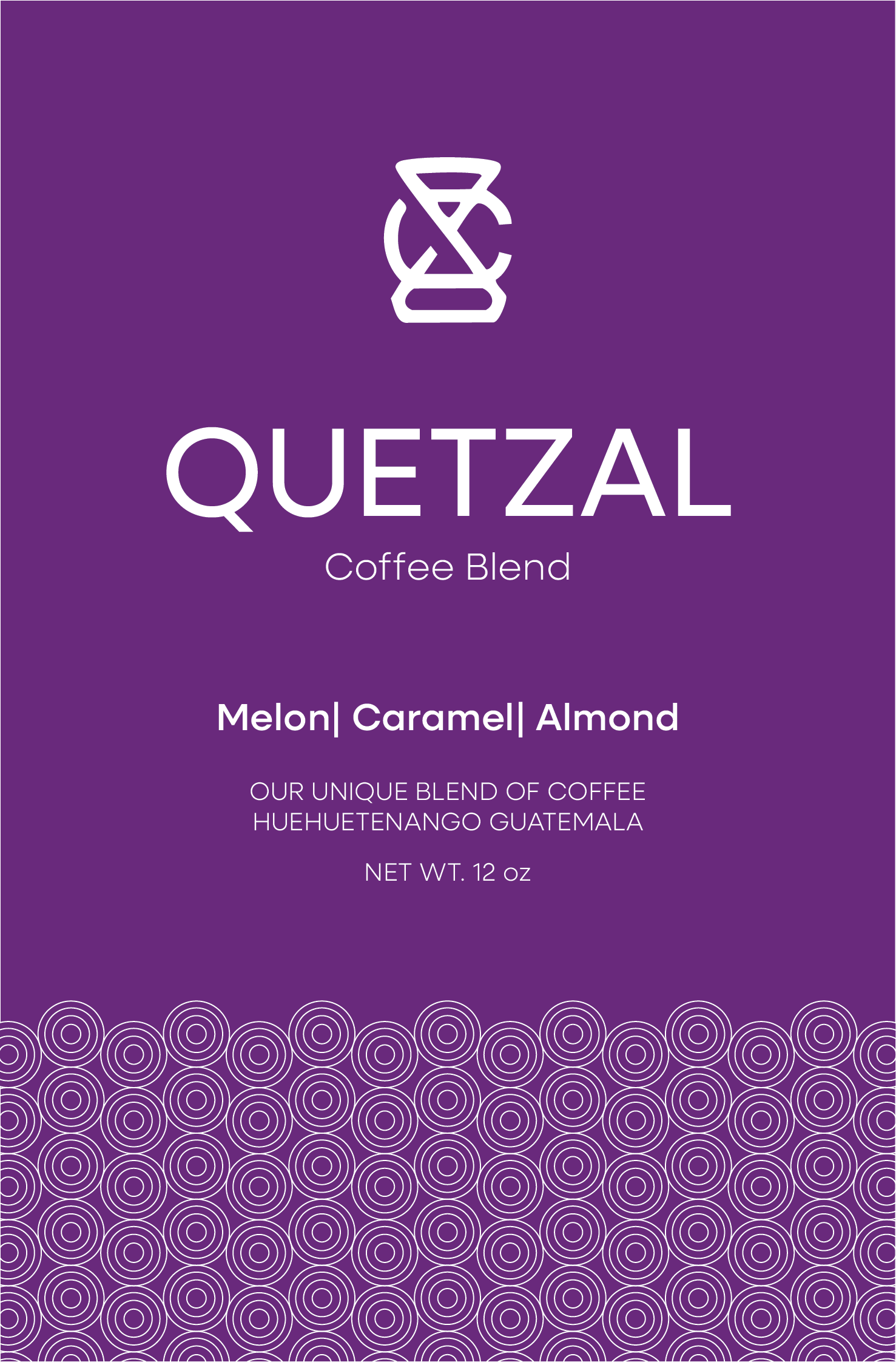
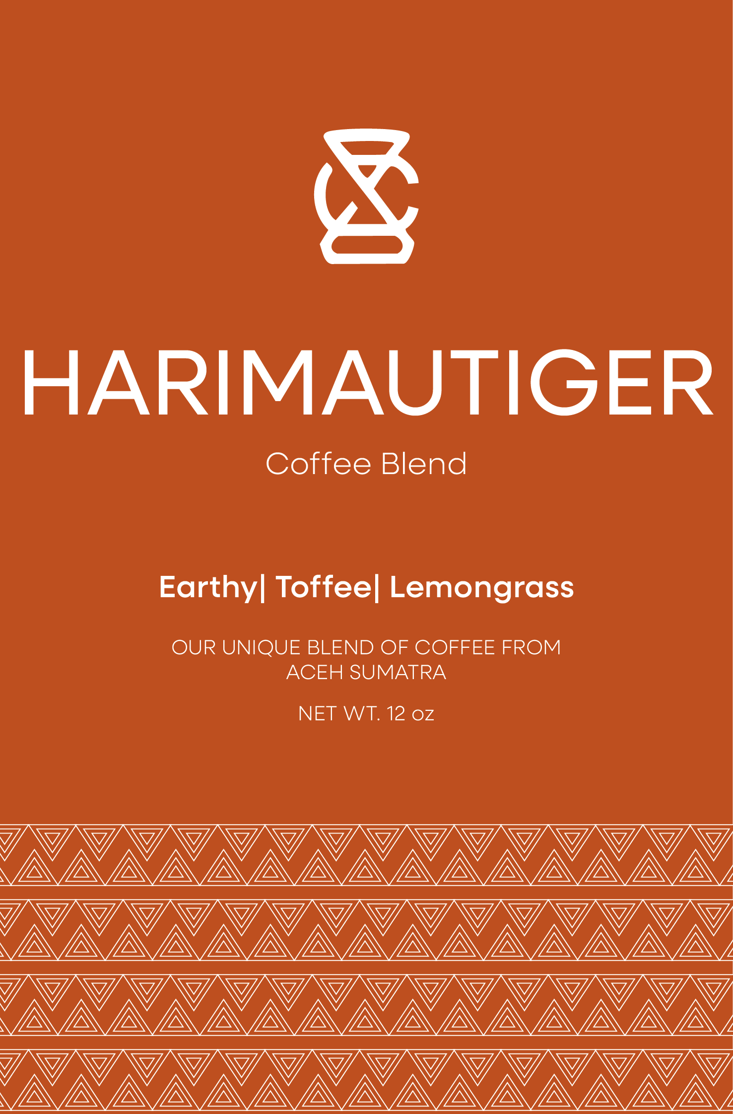
The original packaging relied on a plain square-bottom bag with minimal color, making it easy to overlook and difficult to distinguish between blends. Key information, including flavor details and brand copy, also lacked hierarchy and readability. The goals were to create a more eye-catching, recognizable packaging system that improves clarity and readability.
Overview
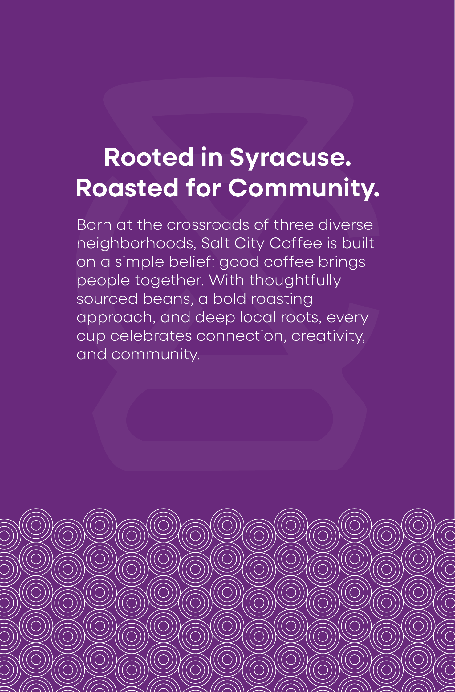
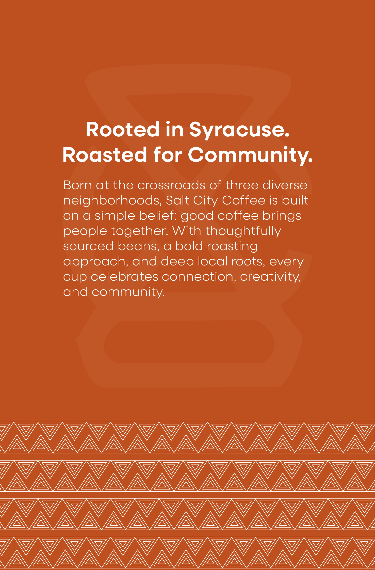
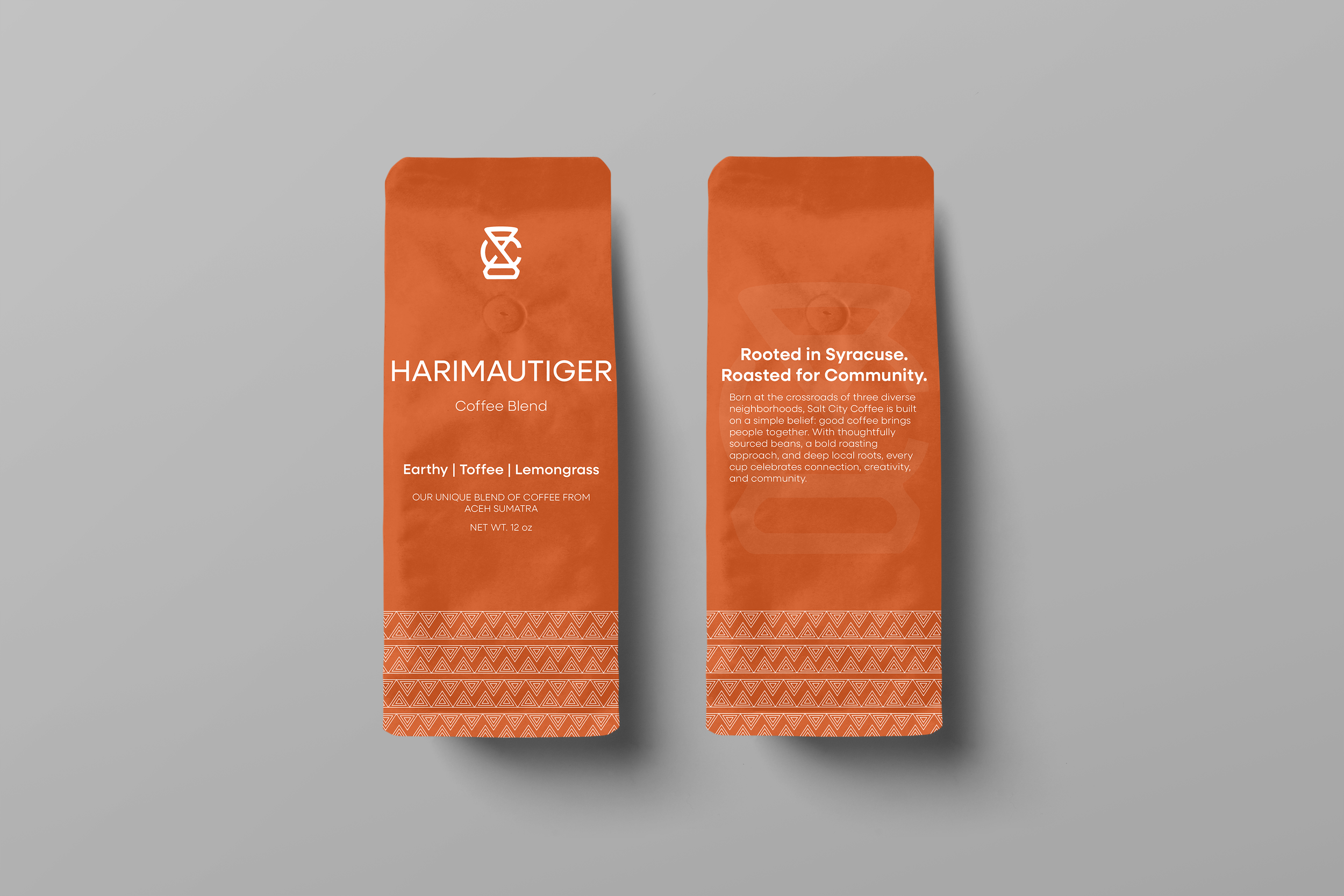
Reimagined packaging for Salt City Coffee, a specialty coffee roaster. I redesigned three of the brand’s blend bags, introducing a refreshed visual identity while maintaining the core essence of the original brand. The goal was to bring new energy to the packaging system, making it more vibrant, cohesive, and visually engaging in-store and online.
Process
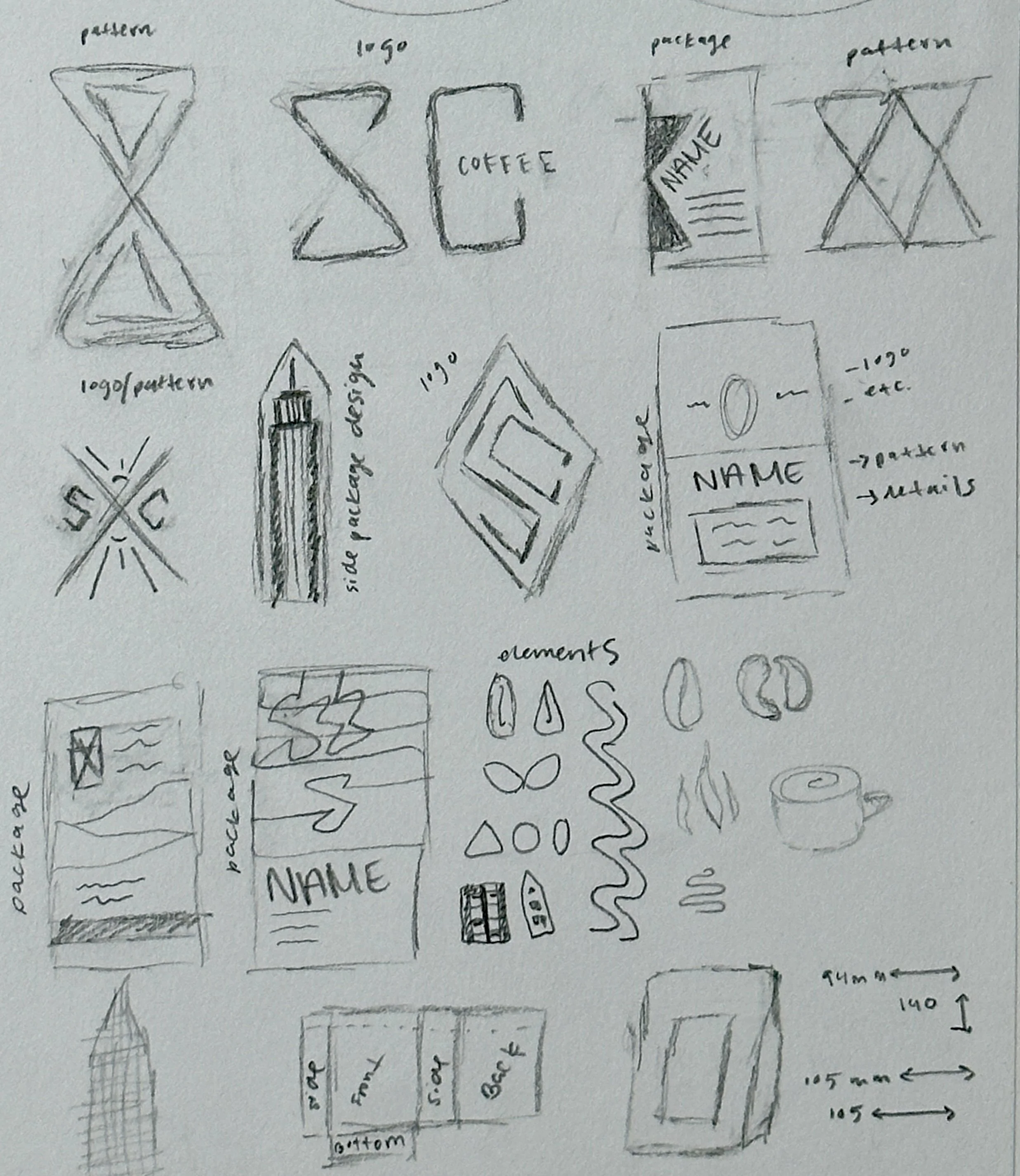
Research
Began with product and market research, analyzing coffee packaging across competitors. I focused on layout, typography, color, and pattern systems to understand what makes packaging both functional and visually compelling. Then, drew initial concepts for the bags, exploring structure, logo applications, and supporting visual elements such as icons and patterns.
Design Development
I translated sketches into digital compositions, experimenting with hierarchy, spacing, and pattern integration. Through iteration and feedback, I developed a consistent layout system across all three bags, using color and pattern variations to differentiate each blend while maintaining a unified look.
Solution
The final designs introduce a refreshed visual system built on bold color, custom patterns, and improved typography.
Each bag shares a consistent structure, making the brand more recognizable, while distinct colors and graphics help differentiate flavors. Information is clearer and more accessible, allowing the product details to stand out. The result is packaging that feels cohesive, engaging, and easier to navigate, strengthening both shelf presence and brand identity.
Working within an existing brand challenged me to enhance the design while preserving its core elements, including the logo and overall tone. This project strengthened my ability to balance creativity with constraints, refine visual systems, and design with both aesthetics and experience in mind.
Takeaways