
Why Emotion Matters in Design and Communication
Design isn’t just about how something looks. It’s about how it makes people feel. Whether you’re creating a brand identity, building a website, or shaping a campaign, emotional connection is what turns passive viewers into engaged audiences. People don’t just remember information. They remember experiences. For aspiring creatives and communication professionals, understanding this difference is key to creating work that actually sticks.
Understanding Emotion: More Than Just Feeling
To design with emotion, you first need to understand it. One of the most useful and widely referenced frameworks is Robert Plutchik’s Wheel of Emotions, which maps out eight primary emotions and their variations. This model helps designers think beyond surface-level reactions and consider emotional complexity. For example, combining anticipation and joy can create optimism, an emotion often used in branding and digital marketing. Understanding these emotional layers helps you design with intention instead of guessing and assuming.
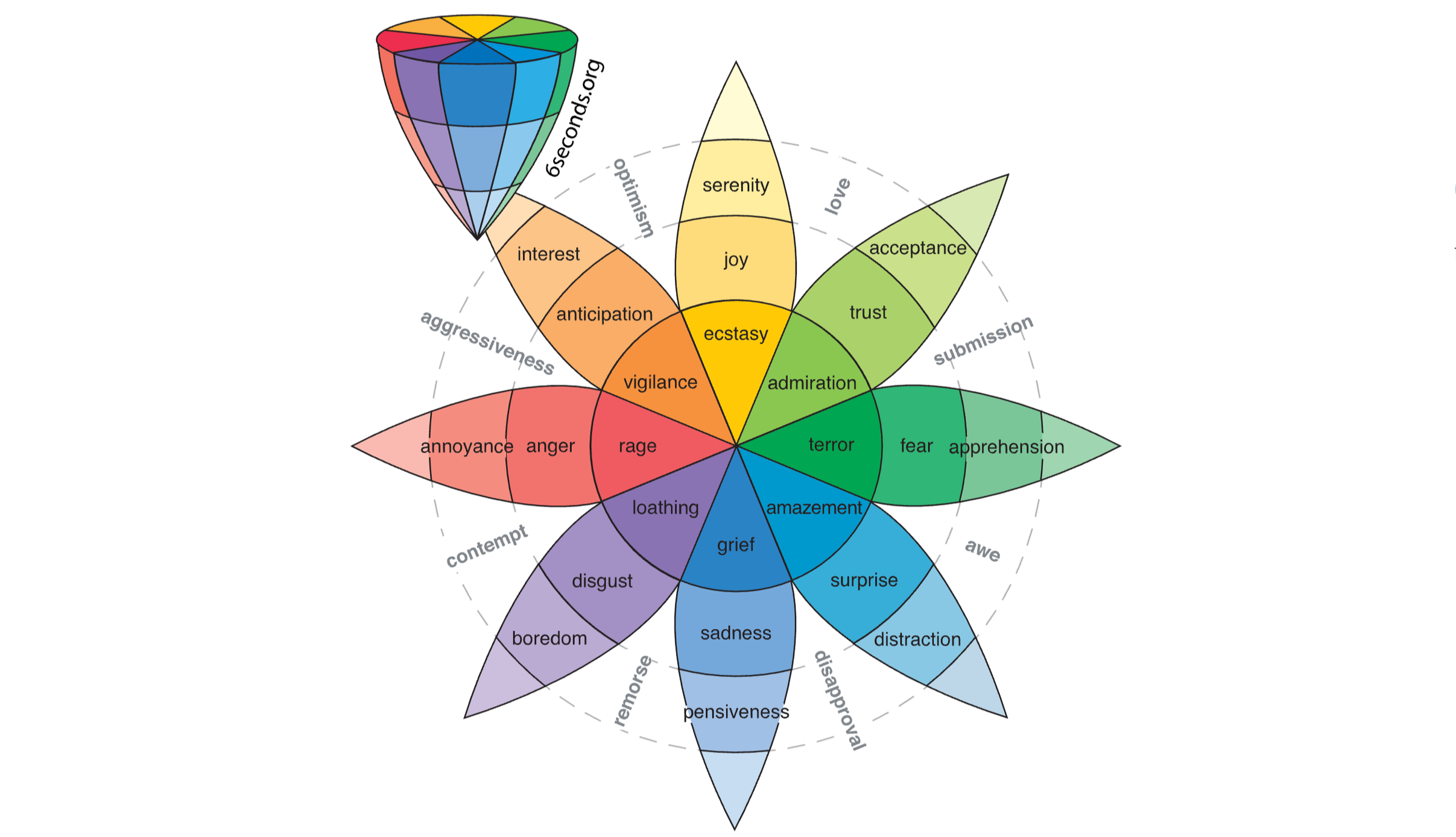
The wheel of emotions related to colors is often used to guide emotional intent (SixSeconds)
The Psychology of Color
Color is one of the most immediate emotional triggers in design. Before a user reads a single word, color has already shaped their perception.
Red can evoke urgency, passion, or danger
Blue often communicates trust, calm, and professionalism
Yellow suggests optimism and energy
Black can imply sophistication or power
These associations aren’t random. Using color strategically can reinforce your message and guide user behavior. A 2020 study surveyed 4,598 people from 30 countries and found that people commonly associate certain colors with specific emotions.
Pink: 50% linked pink with love
White: 43% of people associated white with relief
Green: 39% linked green to contentment
Purple: 25% associated purple with pleasure
Color choices shouldn’t be purely aesthetic. They should match the emotional tone you want your audience to experience.
Typography Speaks Volumes
Typography is often underestimated, but it plays a big role in emotional communication. Fonts carry personality and influence based on their look. Serif fonts can feel traditional, reliable, and authoritative. Sans-serif fonts often feel modern, clean, and approachable. Script and handwritten fonts can evoke elegance or intimacy.
“We all have different cultural backgrounds and experiences that affect our perception of type one way or another. So, regardless of the designer’s skill and effort, a number of uncontrollable aspects remain, including the viewer’s perception, expectations, knowledge, experiences and preferences.” (Smashing Magazine)
Even spacing, weight, and size shape how a message is received. A bold, tightly spaced headline creates urgency, while a light, airy font feels calm and open. If you’re building a brand or campaign, your typography should sound like your message before it’s even read.
Storytelling: Designing for Connection
At the core of emotional design is storytelling. People connect with narratives, not just visuals or data. A strong story gives context, builds empathy, and makes things more memorable. Think about the brands or campaigns you remember most. They probably made you feel something. That’s not accidental. It’s intentional storytelling layered with emotional cues. Nielsen Norman Group notes that storytelling in design usually includes relatable users, a clear problem, context, and a meaningful resolution. When paired with thoughtful visuals, storytelling turns design into an experience.
If you’re pursuing a career in design and communication, your goal isn’t just to inform. It’s to connect. Emotional design helps build trust, increase engagement and retention, and create memorable brand experiences. This counts even more in a world where attention spans are short and competition is high. Emotion cuts through the noise, but it requires a real understanding of your audience’s needs, values, and experiences.

Hi, I’m Allison!
I am a graphic and interactive designer, ready to craft strategy-driven and engaging designs for you now!